How to Get the Rustic Living Room Look Step by Step
Rustic living room decorating with wood tones, texture and lighting: how to get a warm, grounded room that feels lived-in.
This post contains affiliate links. As an Amazon Associate I earn from qualifying purchases. If you buy through our links, we may earn a commission at no extra cost to you.
Some living rooms look sterile even when the furniture is nice and the colors are fine, like a showroom nobody's allowed to use. A good rustic living room feels the opposite: there's warmth in the wood, texture on every surface, and light like amber honey instead of a dental office. That comes from deliberate choices more than money or square footage, and from making the room feel grounded and comfortable rather than old or expensive. Here's how to build it from the ground up, without faking it.
Start with the Right Wood Tones and Stop Overthinking It
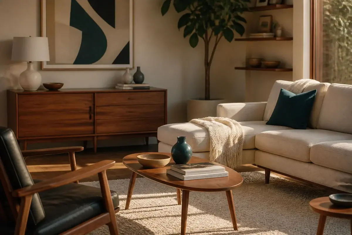
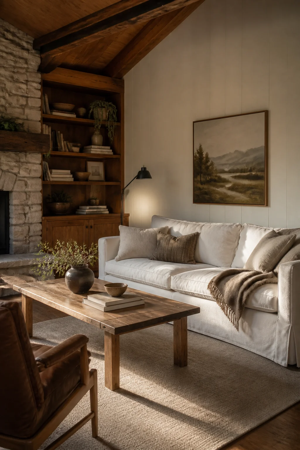 Rustic lives or dies on wood. The usual advice is to mix warm and cool tones for depth, but that's a quick route to a room that looks unplanned. Commit to one dominant wood temperature and stay there. If you're bringing in a medium walnut sofa table or bookshelf, keep your accent pieces in the same family: burnt sienna, tan, honey. Don't scatter mismatched wood all over the room like you're furnishing five apartments.
The trap is treating wood like a neutral when it's the anchor everything else hangs off. Light oak flooring under dark espresso shelving reads chaotic, not layered, because the two are arguing about undertone. Red oak leans pink, white oak leans greige, walnut leans cool brown, and pine and hickory sit firmly in the gold range. Hold a stain sample or a spare drawer front against your floor in daylight before you buy. If it reads faintly green or pink next to the boards, that gap won't vanish once the piece is in the room.
Let one substantial item set the temperature: a wood-framed sofa, a media console 60 to 72 inches wide, or shelving that fills most of a wall. Smaller accents can drift a shade off without anyone noticing, and distressed or unfinished pieces are especially forgiving, since the grain reads as texture before it reads as color. If an inherited piece fights the room, gel stain runs about $20 a can and goes straight over the existing finish, no stripping. Most gel stains are oil-based, so work with a window open and spread the rags flat outside to dry when you finish (NFPA on oily rags).
Texture Is the Secret to Avoiding That Staged Feeling
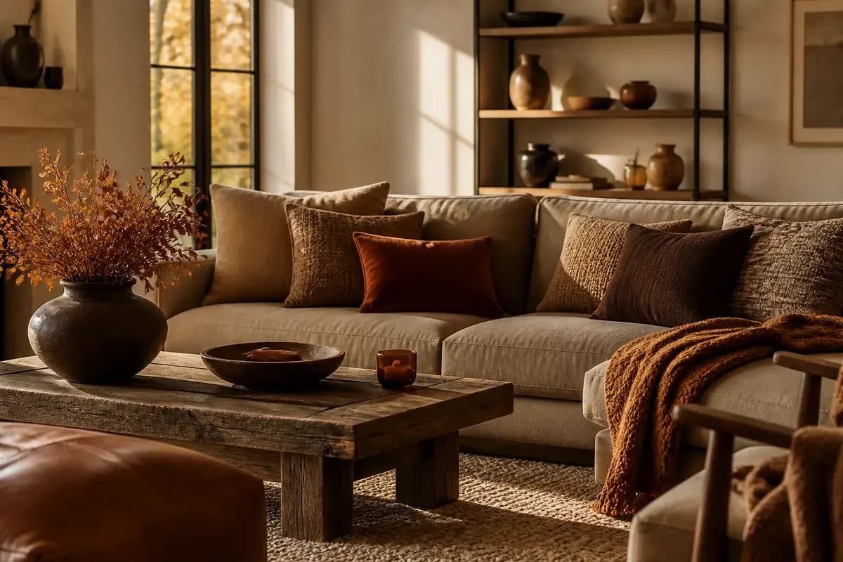
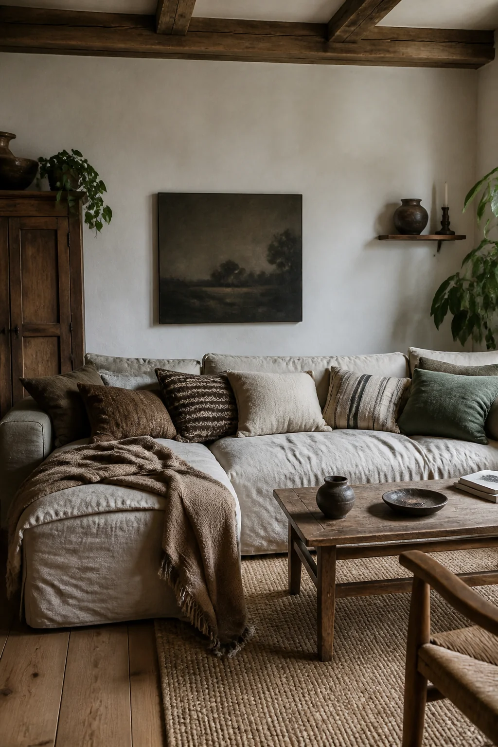 A living room full of smooth surfaces looks flat, even if the colors are perfect. Rustic spaces pull you in because they give your hands something to do. A linen throw on the arm of a sofa. Jute under your feet. Rough-hewn wooden beams or a stacked-stone accent wall. Leather. Burlap. Chunky knit pillows.
One chunky throw over the arm of a smooth leather sofa is where most rustic rooms stop, and a single rough surface in an otherwise slick room reads as a prop rather than as warmth. Texture needs to layer. Aim for at least three different surfaces in your sightline, and make them behave differently: a wool rug (about $300 to $500 for a good 8x10), leather that scuffs and softens, linen or canvas on your sofa, a couple of woven baskets, a cable-knit throw.
Two small details do more than they should. When the covers go in your cart, size the inserts two inches over them instead of matching: a 20-inch down-blend insert behind an 18-inch cover is what makes a pillow slump into a soft shape rather than stand at attention like a hotel bed. Then slide a 1/4-inch felt-and-rubber pad under the rug, roughly $60 to $100 in an 8x10, which gives the wool enough spring that the whole floor feels softer underfoot.
The wood itself already counts as texture. So does full-grain leather, which is why it's worth the premium over bonded: it takes a patina rather than peeling.
Lighting Is Where Most Rustic Rooms Go Wrong
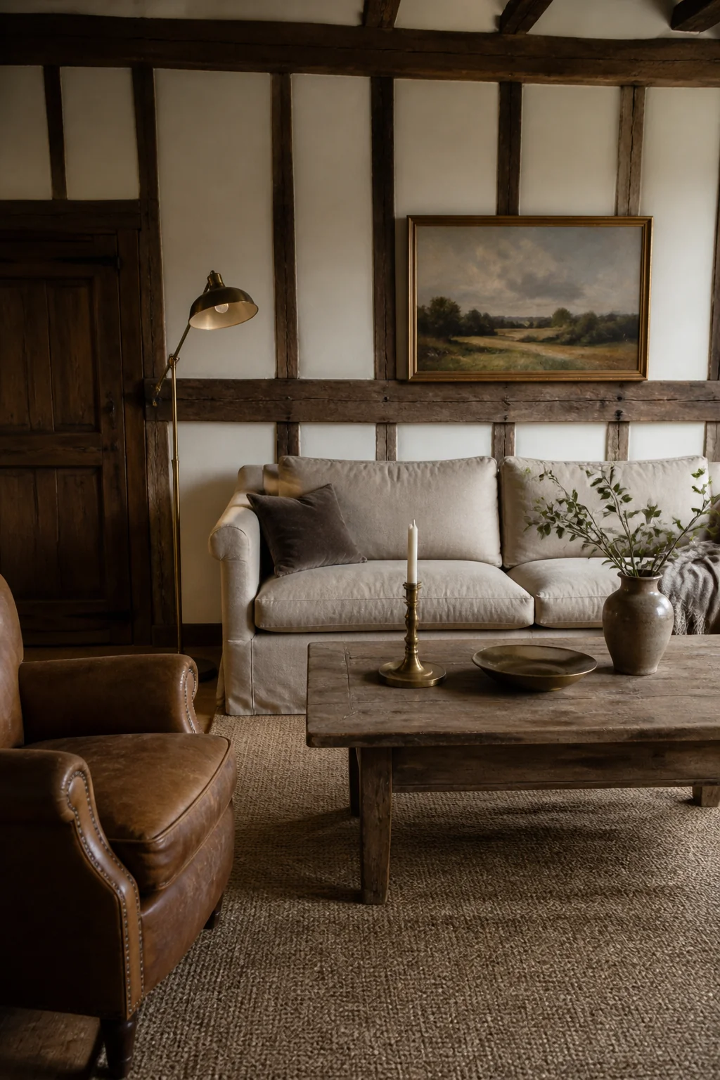 Rustic lighting isn't just about choosing the right fixture. It's about the color of the light coming out of it. A 4000K LED bulb will flatten any rustic space, no matter how good the furniture is, because cool white pulls the yellow out of wood and leaves oak looking gray. You want 2700K, and a bulb rated CRI 90 or higher if you can find one, since better color rendering is what lets grain and rust tones read as themselves.
Brightness matters as much as warmth. Roughly 800 lumens per bulb, the old 60-watt equivalent, spread over several sources instead of one big ceiling fixture. Layer by height: a statement fixture in aged brass, wrought iron, or wood; sconces about 60 to 66 inches off the floor if you have a fireplace to flank; and two table lamps whose shades land near eye level when you're seated, which usually means a 26 to 30 inch lamp on a 24-inch side table.
Put all of it on dimmers. An LED-compatible dimmer costs $20 to $30, and the failure mode is worth knowing about: pair a cheap dimmer with bulbs that aren't marked dimmable and you get buzzing, flicker, and bulbs that die early. At night you shouldn't have to think about the light at all. It should just feel warm and inviting, like the room is pulling you toward a chair.
A Real Rug Grounds Everything
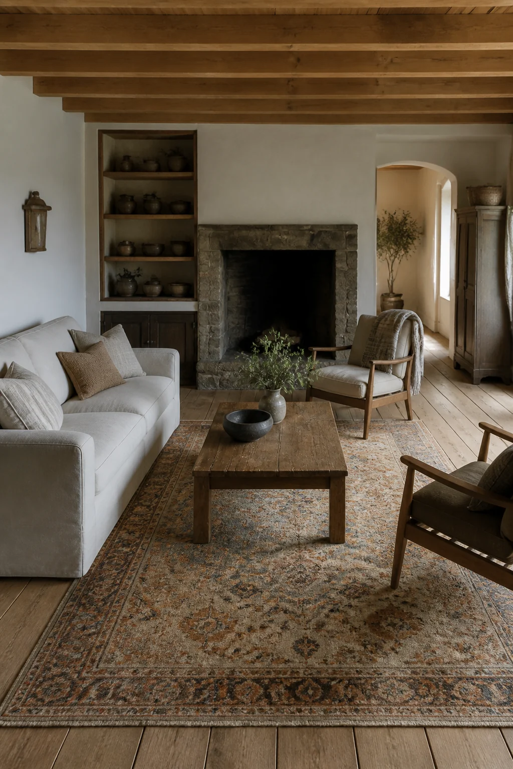 The rug is almost always too small, and that alone is what makes a room read cramped and unfinished. A 5x7 or 6x9 covers most living rooms, but measure your space first. Your rug should extend at least 12 inches beyond the edge of your seating on all sides, so your front sofa legs and at least the front legs of side chairs sit on it, not beside it. Tape the outline on the floor before you order. Ten dollars of painter's tape has saved a lot of return shipping.
Choose natural fibers when you can: wool, jute, or a blend. A wool or wool-blend Persian or Turkish rug runs $200 to $600 for a quality piece and will last decades, and wool hides crumbs because the fiber springs back instead of matting. Jute is warmer than sisal and looks right in a rustic room, but know what you're signing up for: it sheds for the first month or so, and it stains wherever water sits, which makes it the wrong pick next to a dog bowl or under a toddler.
The color should be warm and grounded. Warm gray, tan, rust, burnt orange, or deep cream. Avoid anything crisply geometric or bright white. An older-looking pattern, an overdyed effect, or a plain natural weave all sit better under wood.
Fireplace Details Make or Break the Room
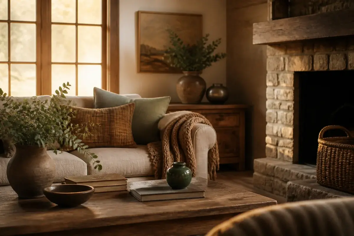
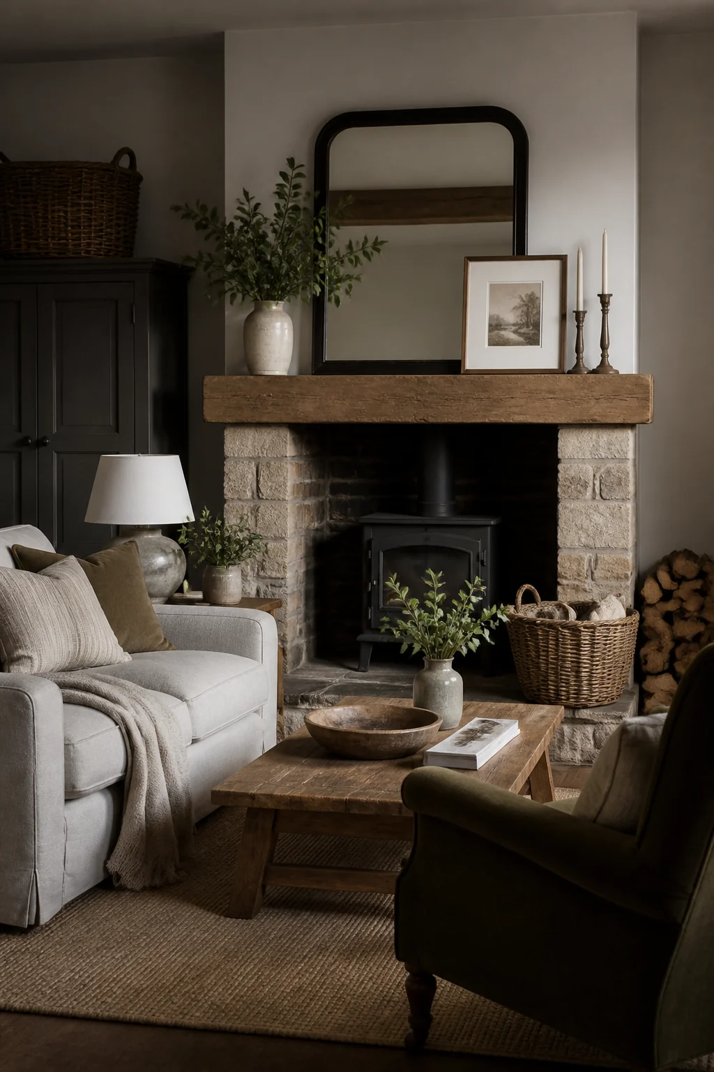 If you have a fireplace, it becomes the focal point whether you planned it or not. Make it earn that attention. A black or dark metal surround works. Raw brick looks right. Stacked stone feels authentic. Whitewashing is the choice people regret, because paint on brick is close to permanent: getting it off means stripper, a wire brush, and a lost weekend. Limewash, around $70 a gallon covering about 250 square feet in two coats, soaks into the masonry instead and can still be softened or partly washed back while it's fresh.
One rule here isn't about looks at all. Combustible mantels and trim have clearance requirements, and residential code keeps combustible material at least 6 inches back from the firebox opening, with anything inside 12 inches of the opening limited to 1/8 inch of projection for every inch of distance. A chunky reclaimed beam hung low over the firebox can be beautiful and still fail an inspection.
Style the mantel spare. A framed mirror in wood or metal, sized to leave 6 to 8 inches of bare shelf at each end, hung 4 to 8 inches above the mantel. Candles, flameless ones if you light the fireplace, since the shelf right above the firebox runs hot. One large artwork or a small cluster. A woven basket.
No fireplace, or a drywall one? Build the focal point with an oversized piece of art, a gallery wall of rustic frames, or floating shelves. The principle doesn't change: it should look decided, not random.
Stick to a Tight Color Palette and Trust It
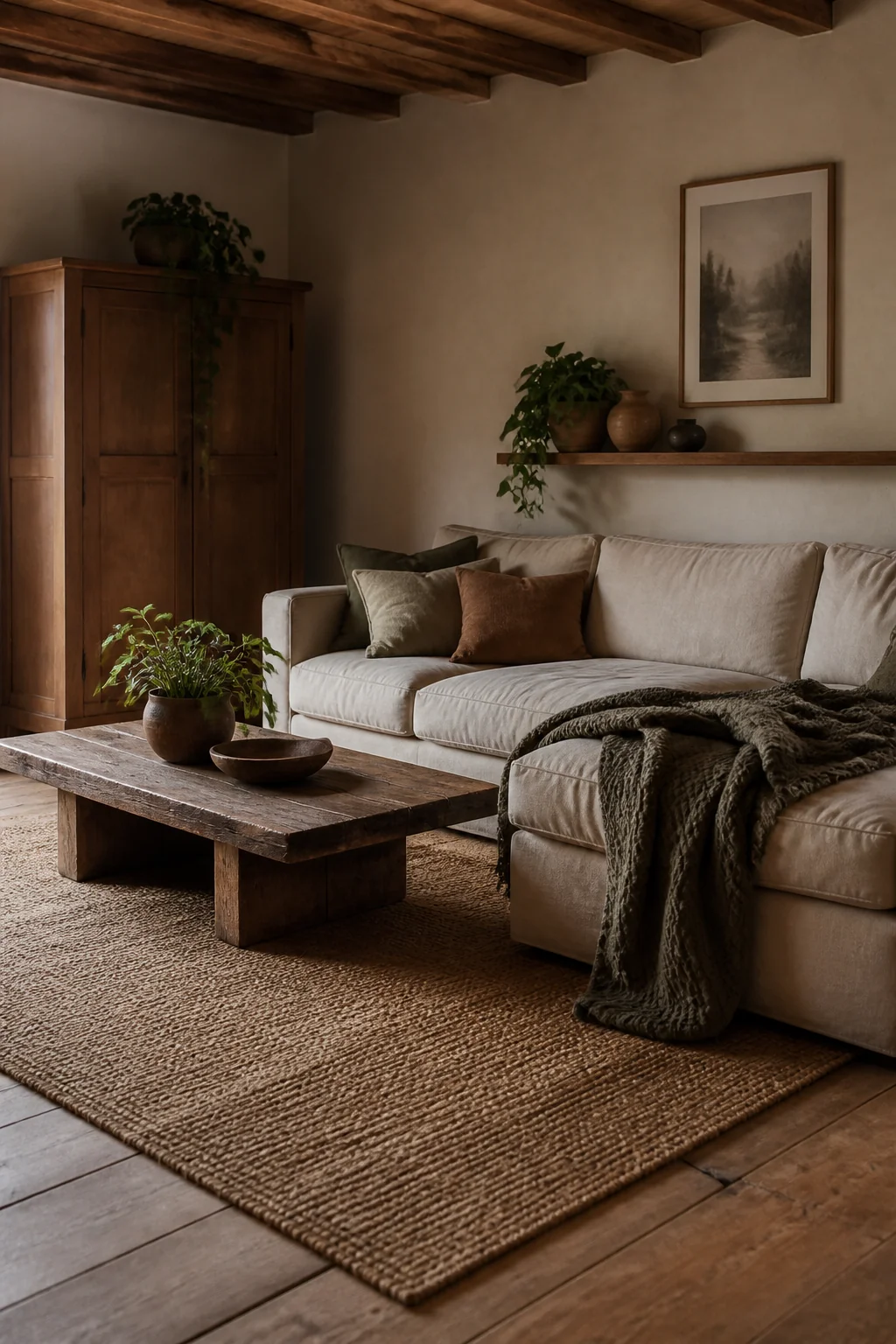 Rustic rooms work because they use color sparingly. You're not adding five accent colors. You're using maybe three: your dominant warm wood tone, a neutral (warm white, cream, or warm gray), and one accent that feels natural, like rust, sage, or deep navy.
Pull that accent from something that grows or weathers: rust from clay, green from plants, cream from stone. Those colors already sit together outdoors, which is why they don't fight indoors. A living room with wood, cream, rust, and sage feels complete. The same room with wood, cream, rust, sage, navy, and burnt orange feels like you couldn't decide.
Wall color is where the plan usually slips. A white with a blue base turns wood tones gray; a warm white with a yellow or greige base, the White Dove and Swiss Coffee end of the range, keeps them warm. Buy sample pots, paint two coats on a 2-foot square of poster board rather than straight on the wall, then move that board around the room at 9am and again at 8pm under your lamps. Paint shifts more between those two moments than most people expect.
Your accent color should then appear in at least three places: a throw pillow, a stripe in the rug, artwork, an accent chair. Repeated, it reads as a decision rather than an accident.
Objects and Art Matter More Than You Think
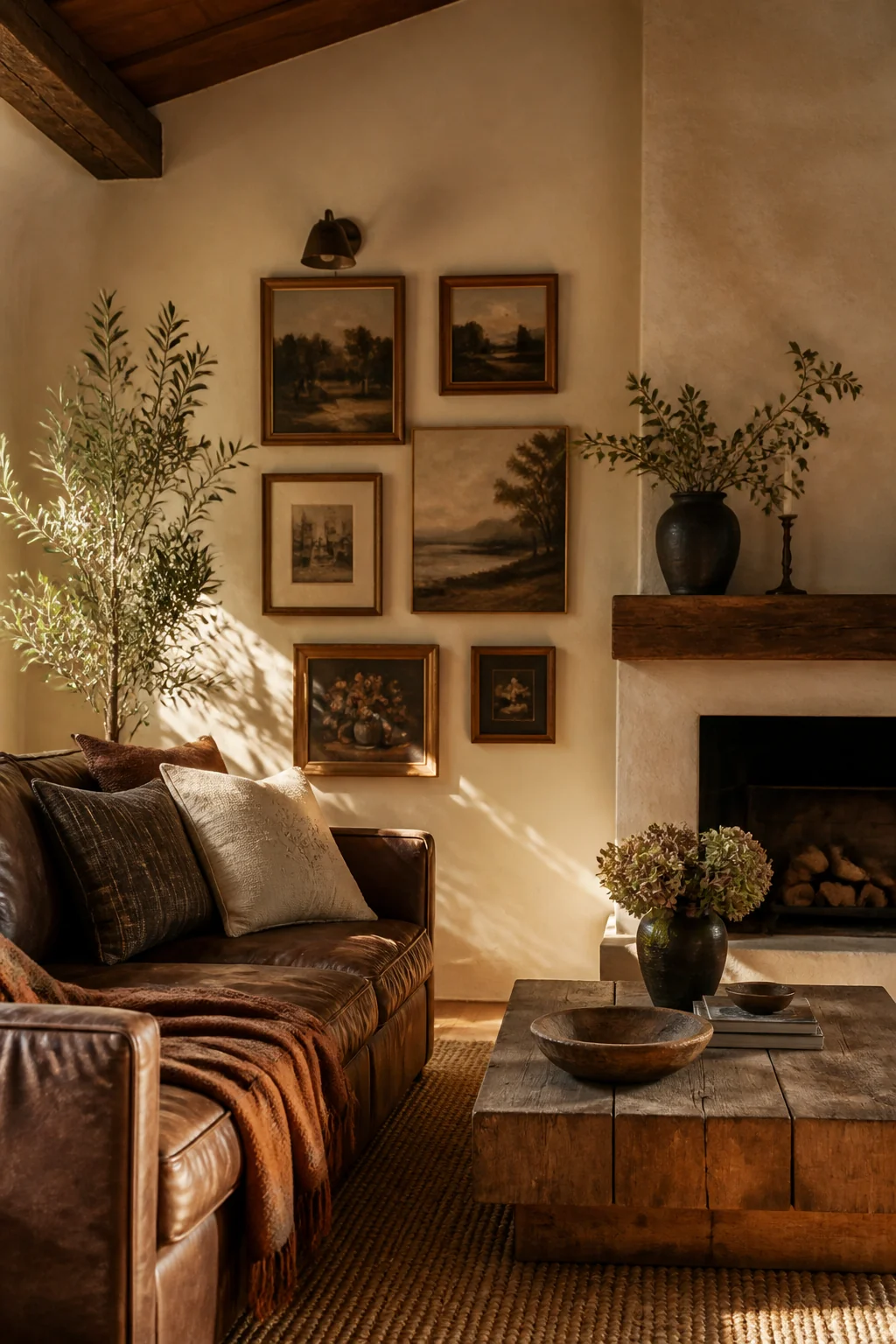
Rustic isn't about blank walls. It's about walls that tell a story without being precious about it. A corner wall gallery with a mix of framed prints, textiles, and mirrors works beautifully. Oversized single artwork in a wood or metal frame. A collection of woven wall hangings.
The problem is rarely quantity, it's tone. A sleek modern print on a gallery track system reads cold against wood and wool. A series of botanical prints in mismatched vintage frames, or five flat baskets grouped on the wall, sits right.
Hanging height settles the whole wall down, and it is worth working out before you commit to a frame size. The center of the arrangement belongs 57 to 60 inches off the floor, roughly average eye level, and the lowest frame still needs 8 to 10 inches of clearance above the sofa cushions so the art and the furniture look related. Measure between those two lines and you have the tallest block your wall will take, which is the number to shop against. Keep 2 to 3 inches between frames so the group reads as one shape instead of scattered pieces.
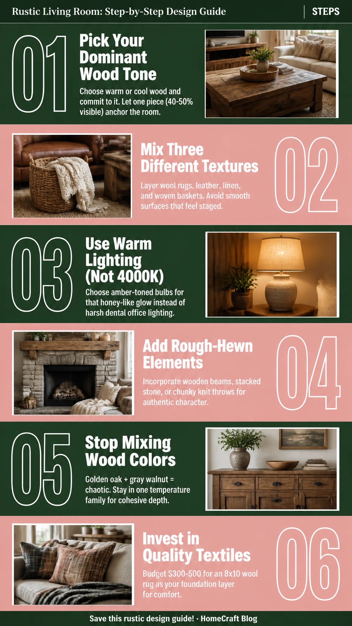
The whole guide in one image
Shelves follow the same logic. Work in small groups, vary the heights, leave real gaps: books stacked flat with a ceramic vessel on top, a wooden box, one trailing plant. Nothing on that shelf has to be expensive or old. It has to look like someone put it there and then lived around it.