11 Calm Japandi Kitchen Ideas Built on Oak, Linen and Matte Black
Oak cabinets, linen textiles and matte black hardware: 11 japandi kitchen ideas you can copy, from open shelving to warm lighting.
This post contains affiliate links. As an Amazon Associate I earn from qualifying purchases. If you buy through our links, we may earn a commission at no extra cost to you.
Most kitchens that try for a calm, Japanese-inspired look end up feeling like a showroom. The cabinets are pale, the counters are bright white, and the hardware is a shiny chrome that catches the light from every angle. The room looks tidy, but it also looks cold and a little unfinished. The fix is rarely more décor. It's a shift in material and proportion: warm wood that carries the eye, soft textiles that absorb sound and light, and a few dark accents placed with restraint. Japandi blends Japanese simplicity with Scandinavian warmth, and the kitchen is where that balance either works or falls apart. Below are eleven ideas we would build on, with the look, the reason it holds together, and how to get it in a regular kitchen.
1. Run oak cabinet fronts from floor to ceiling
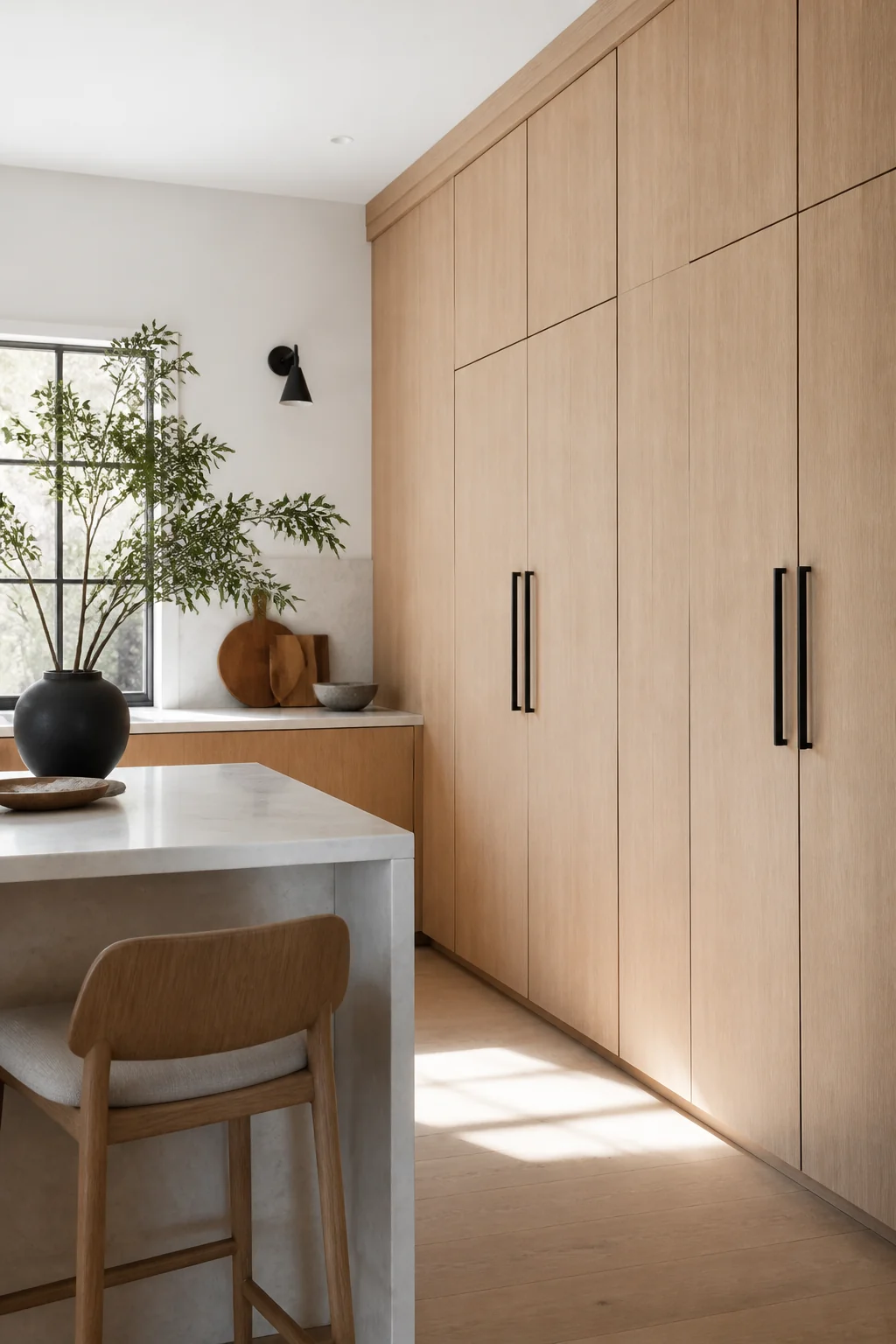
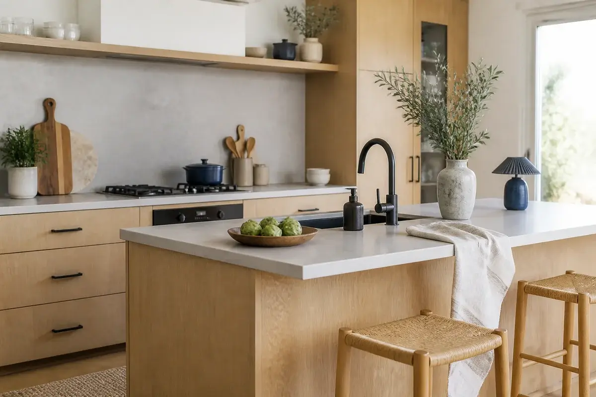
The look is a wall of light, close-grained oak doors with flat panels and no visible trim, running up to the ceiling line. Above them, the upper cabinets stop at the crown instead of leaving a gap of painted drywall. The result reads as one continuous warm surface rather than a stack of boxes.
Why it works: a single material across a large plane creates calm. The eye has nothing to bounce between, so the kitchen feels quieter even when it's full of appliances.
How to get it: look for white oak or ash veneer with a matte or oil finish, not a glossy lacquer that shows every fingerprint. Ask a cabinet maker to match the grain direction across adjacent doors. If your ceilings are 8 feet, a 36-inch upper run to the ceiling gives you a tall, quiet wall without custom-building anything.
2. Match every black finish to one metal
The look is a matte black faucet, matte black cabinet pulls and a matte black light fixture, all in the same finish and the same slightly warm black. Nothing is brushed nickel, and nothing is polished chrome. The black appears in small, repeated points around the room.
Why it works: repetition of one tone reads as intentional. Mixing three blacks reads as a pile of leftover parts, and that's the most common reason a kitchen with dark accents looks messy instead of calm.
How to get it: choose the faucet first, since it's the largest and most used piece of metal. Pick pulls around 5 to 6 inches center to center for standard drawers, and place them vertically on tall doors. Look for a finish labeled matte black or powder coat rather than "gunmetal," which often reads gray.
3. Let linen work on the window and the seating
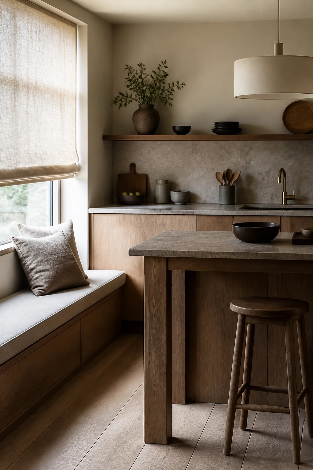
The look is a natural linen roman shade or a flat linen panel at the sink window, in an oatmeal or flax color, with a linen-covered stool or bench cushion nearby. The fabric is unbleached and slightly textured, with visible weave.
Why it works: soft textiles soften the hard lines of oak and black metal. Linen also diffuses daylight, so a window that faces a neighbor or a driveway looks less exposed without losing brightness.
How to get it: mount a roman shade inside the window frame when you have the depth, or just above the trim when you don't. Hang it at the top of the trim, not the wall above it, so the window reads as taller. Keep the linen color within two shades of your wall paint so the fabric blends rather than competes.
4. Keep open shelves to three objects per run
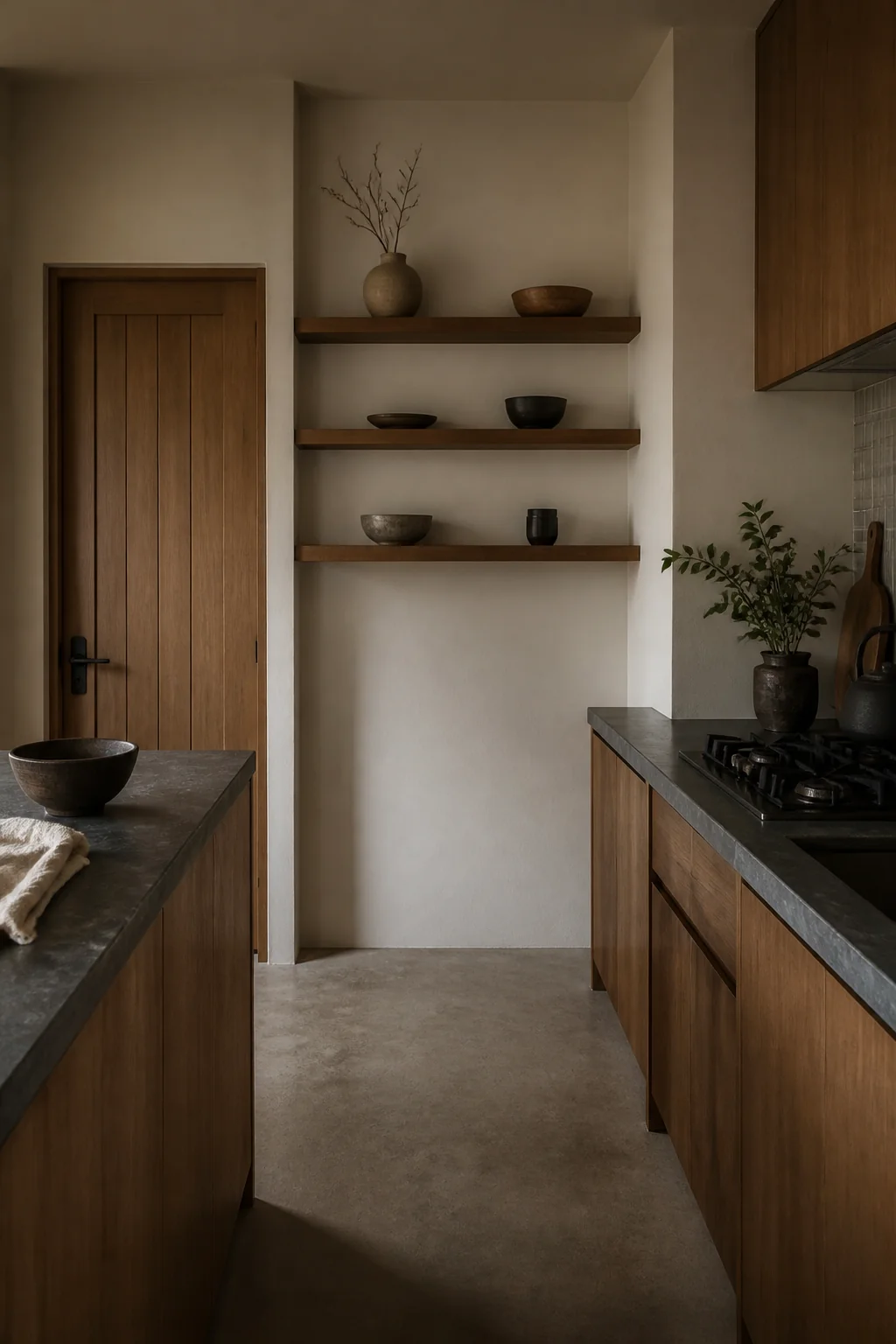
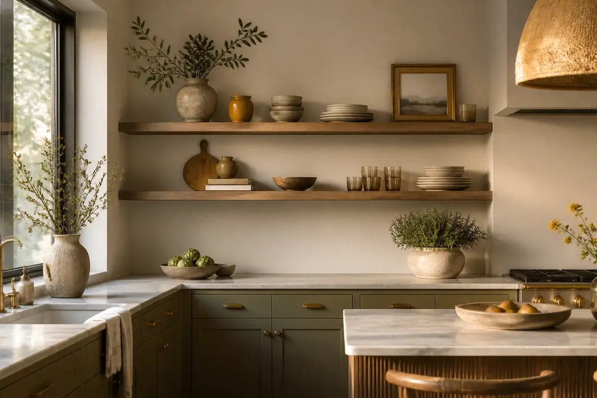
The look is one run of open shelving, usually 24 to 36 inches long, holding three or four objects: a stoneware bowl, a pale vase, a small stack of plates and one plant. Everything else stays behind a door. The shelves sit at eye level or just above the counter.
Why it works: open shelving only stays calm when the number of objects is low. Each object becomes a deliberate point, and the empty space around them does the work. Crowded shelves look like storage, and that's usually what ruins the effect.
How to get it: fix the brackets into studs or use anchors rated well above the weight of loaded dishes. Stoneware and glazed ceramic in ivory, sand or soft gray fit the palette. If you add a candle to the shelf, keep it at least 12 inches from anything that can burn and blow it out when you leave the room.
5. Use a runner at the sink that picks up the grain
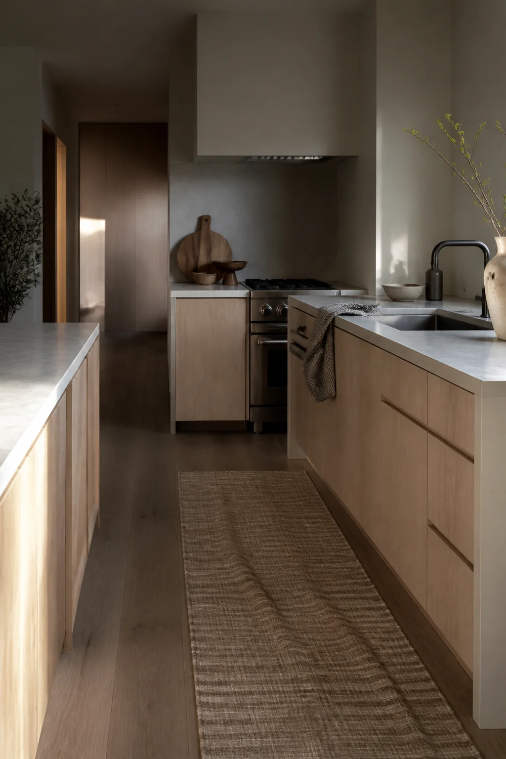
The look is a long, low-pile runner or flatweave in natural jute, wool or cotton, running in front of the sink or range, in a color that matches the oak. The runner is narrow, and it sits on the floor like a single strip of light.
Why it works: a rug in front of the work zone breaks up a long run of hard flooring and gives the eye a place to rest. Matching the wood tone keeps the rug from looking like a separate decision.
How to get it: a runner about 24 to 30 inches wide suits most kitchen aisles, and it should run at least 18 inches past the sink on each side. Leave 12 to 18 inches of floor showing at both ends. The most common mistake is a runner that's too short, which makes the whole room look cramped and unfinished.
6. Paint the walls a warm white with a gray lean
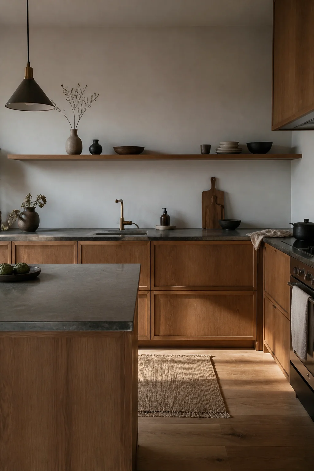
The look is a warm white wall, not a bright, cool white, with a faint gray or greige undertone that keeps it from turning yellow under lamps. It sits against the oak and makes the wood look richer.
Why it works: a white with too much yellow makes oak look orange, and a white with too much blue makes the room feel clinical. A neutral with a slight gray lean lets both the wood and the black accents show their true color.
How to get it: paint a 2-foot square swatch on the wall nearest the window, then check it at night under your normal bulbs. Choose a matte or eggshell finish that can handle wipe-downs near the sink. Keep the ceiling a shade lighter than the walls so the room doesn't feel boxed in.
7. Hang a single pendant over the island at the right height
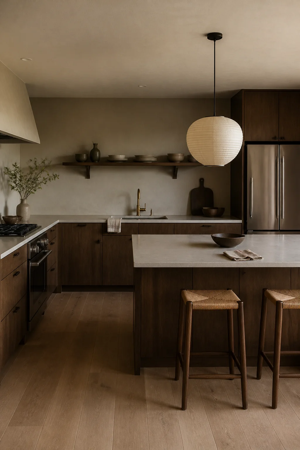
The look is one low pendant with a linen, paper or matte black shade, hung over the island or dining end. There's only one, and it's placed centrally over the work surface. The light is warm, around 2700K.
Why it works: a single fixture gives the kitchen a clear focal point and keeps the ceiling from looking busy. Warm light also softens oak and makes the room feel lived in after dark.
How to get it: hang the bottom of the shade 30 to 36 inches above the counter, and keep it at least 30 inches wide if the island is 4 feet long. Because this involves wiring, switch the breaker off first, or have a licensed electrician install it. Two small pendants look like a mistake unless the island is very long, so start with one.
8. Store cutting boards on a slatted wall rack
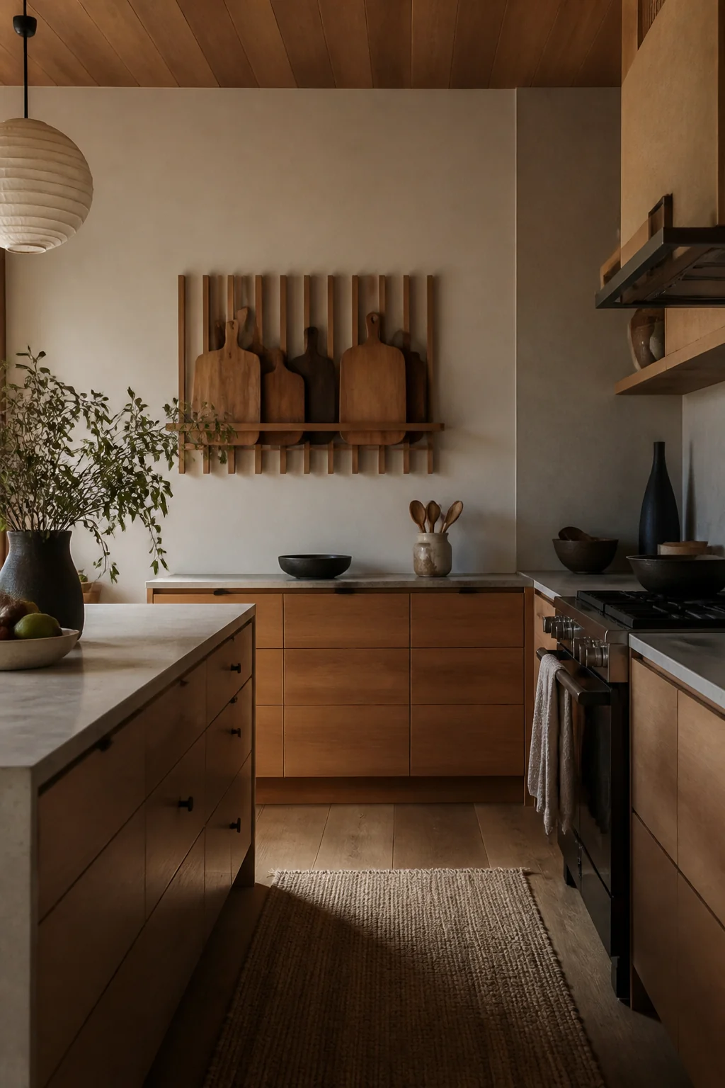
The look is a slatted oak or ash rack on the wall beside the prep zone, holding wooden cutting boards, a wooden bowl and a few wooden utensils upright. The boards are visible but in a neat, sorted line rather than a heap.
Why it works: repetition of the same material creates a calm, almost architectural pattern. The rack adds texture where the wall would otherwise be blank, and it keeps the boards out of a drawer where they get stacked and damaged.
How to get it: mount the rack into studs or use anchors rated above the total weight, since loaded boards are heavier than they look. Sizing matters: a rack around 24 to 30 inches wide holds most standard boards. Keep the rack within easy reach of the prep area, roughly 12 to 18 inches above the counter.
9. Use a soft clay tile or limewash behind the range
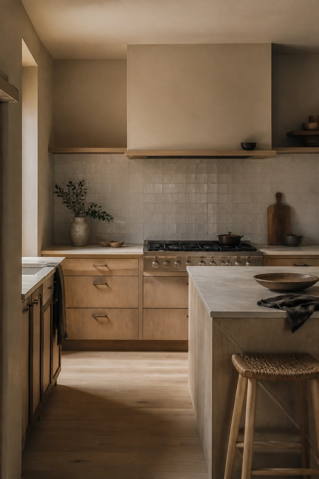
The look is a single band of handmade clay tile or limewash in a muted, earthy tone, running behind the range and up to the hood. The surface is slightly uneven, with visible variation in the glaze or wash, and it sits between oak and white paint.
Why it works: a textured surface behind the cooking zone adds depth without adding pattern. The variation catches light differently than flat paint, so the wall looks softer and more layered.
How to get it: keep the band to the cooking zone, roughly the width of the range plus 12 inches on each side, rather than covering the whole wall. Pick a matte or satin tile, since glossy tile shows grease and reflects too much light. Check that the tile and grout can handle heat from the range, and that the hood is installed to manufacturer clearances.
10. Choose cabinet hardware with a visible joint
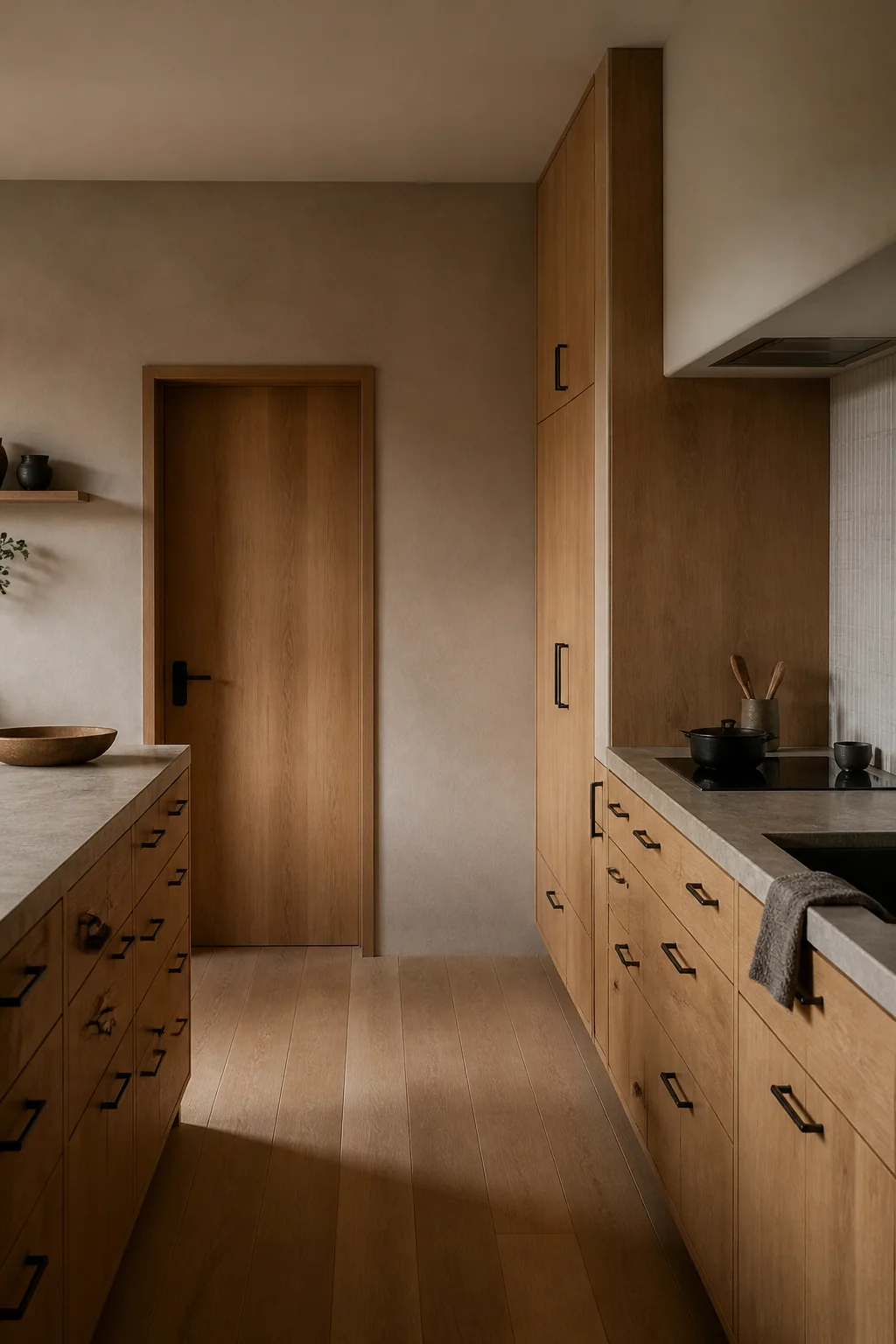
The look is a plain oak door with a slim, recessed or finger-pull edge rather than a bulky handle, and a matte black pull only on the drawers. Some doors have no hardware at all, just a small groove you can open with a fingertip.
Why it works: fewer handles keep the cabinet face clean and let the wood do the work. A groove or finger pull also makes the door look like a continuous plane, which suits the calm, minimal side of Japandi.
How to get it: a finger pull or a routed profile needs a door with enough thickness, usually at least 3/4 inch, so ask your cabinet maker about it before ordering. Use pulls on drawers and lower doors where you grab most often, and skip them on uppers. Mixing both approaches on the same wall is fine if the finish stays the same.
11. Let the island stay the quietest surface in the room
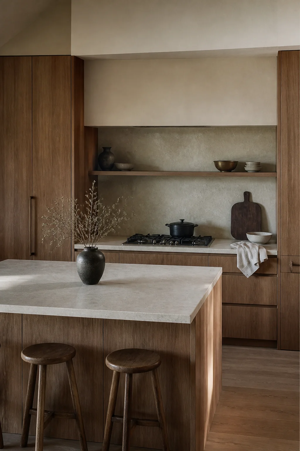
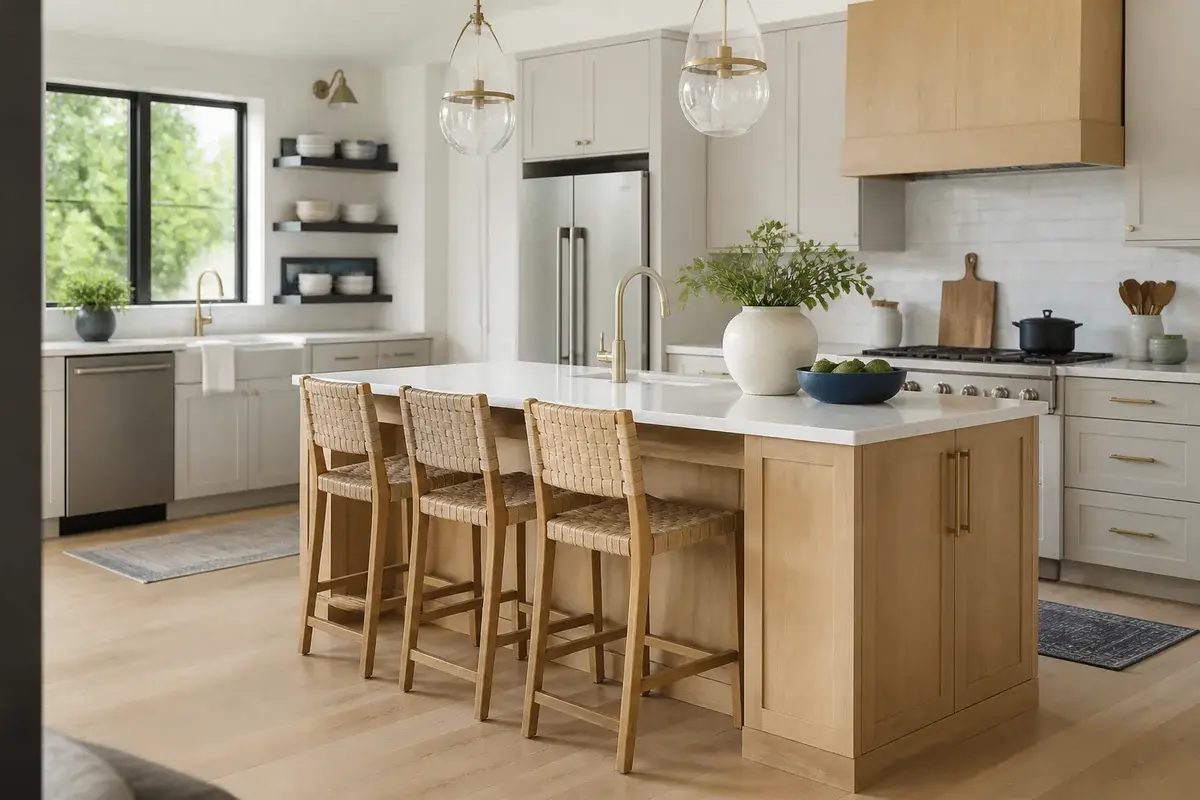
The look is a single island or peninsula in the same oak as the cabinets, or a warm stone in a soft gray or ivory, with nothing stacked on top except a bowl, a cutting board and maybe a small vase. The top is smooth and uncluttered.
Why it works: the island is the largest object in the kitchen. When its surface stays clear, the whole room feels spacious, and the other ideas in this list get room to show. Clutter on the island is the fastest way to make a calm kitchen look busy.
How to get it: plan at least 42 inches of clearance between the island and facing cabinets for a single cook, and 48 inches if two people will pass each other. Choose a counter material with a matte finish, since glossy stone shows every water spot. Store appliances in a cabinet or a pantry, not on the island.
Save this for your next project
The mistake that ruins most of these looks is mixing too many warm and cool tones in one room. Oak, linen, clay and black all work together, but a chrome faucet, a blue-gray backsplash and a yellow wall will fight each other. Pick one palette, check it under your own lights, and keep the finishes matched to the same few materials.