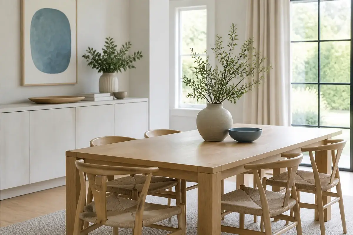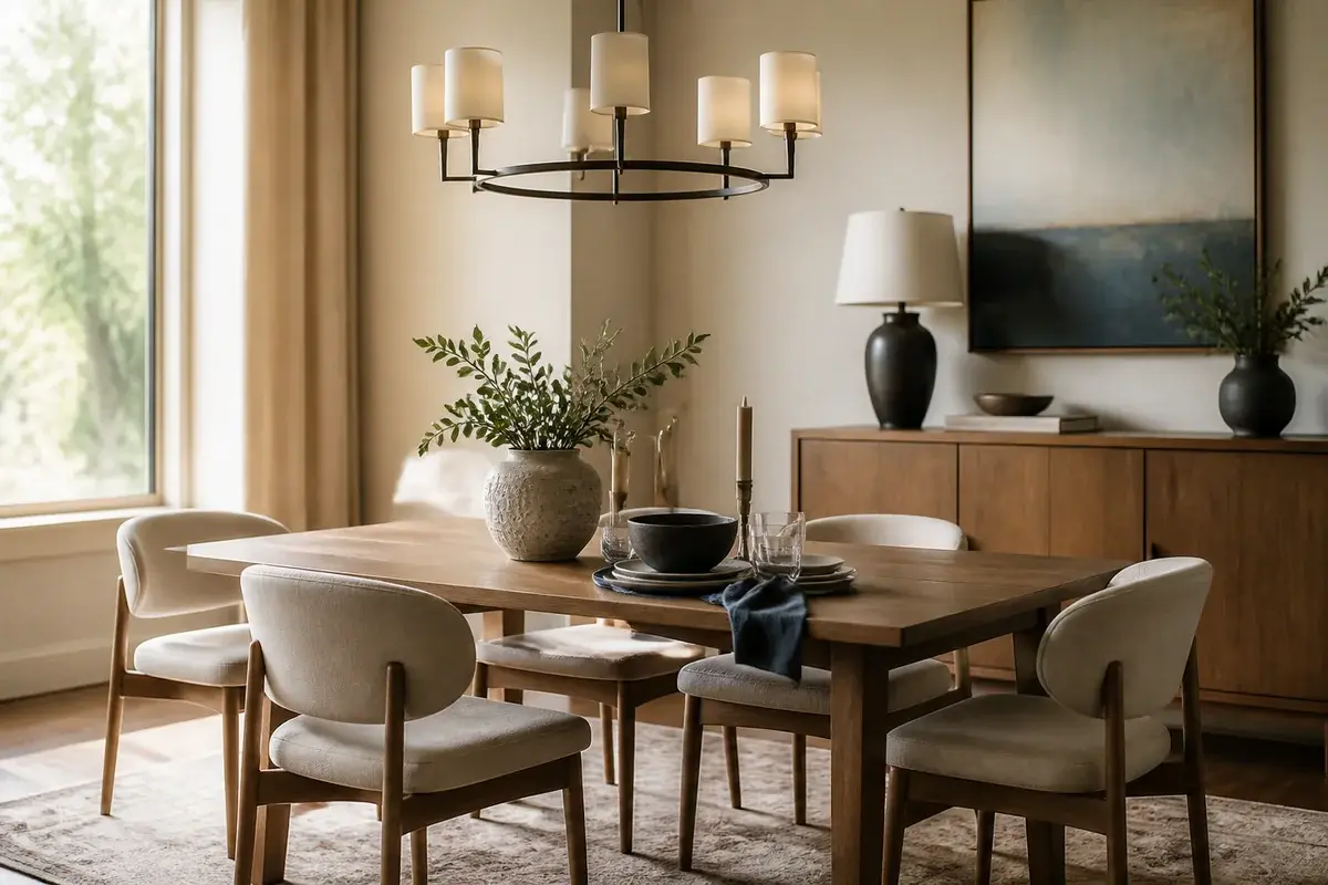
Make Your Fall Dining Room Feel Warm Without Overdoing the Orange
Skip the pumpkin overload. Your fall dining room decor can feel warm and seasonal with color balance and thoughtful restraint.
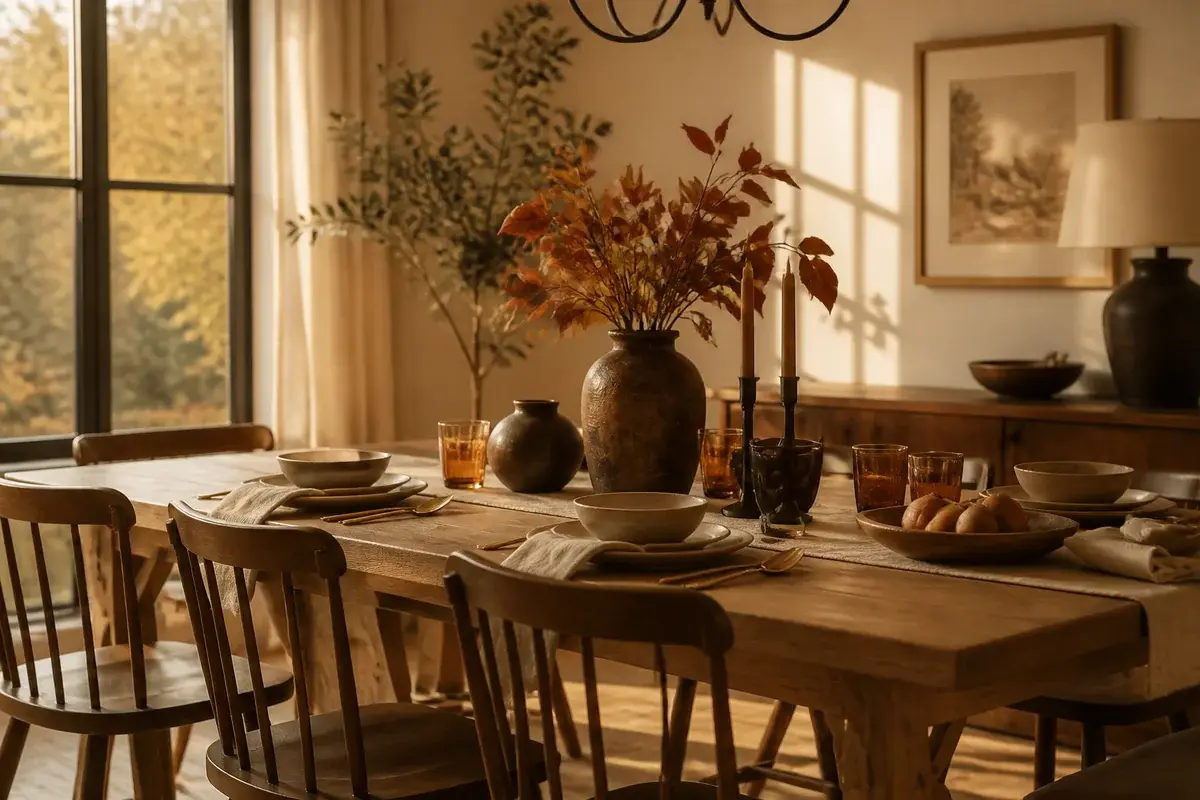
A fall dining room that feels genuinely warm without screaming autumn at you is one where you can sit through November without cringing. The problem is that seasonal decorating has a ceiling, and most people hit it too early. Orange creeps in. Gourds multiply. A room meant for the whole season starts looking like Halloween set dressing by October 15th. You want the feeling of fall - that sense of settling in, the shift toward warmer light, deeper tones - without making your dining table look like a farmers market display.
The good news: warm fall dining room decor is more about what you skip than what you add. It's about light, fabric weight, and color choices that read as autumn without announcing it. Here's how to get there.
The Color Palette Comes First, Not the Decorations
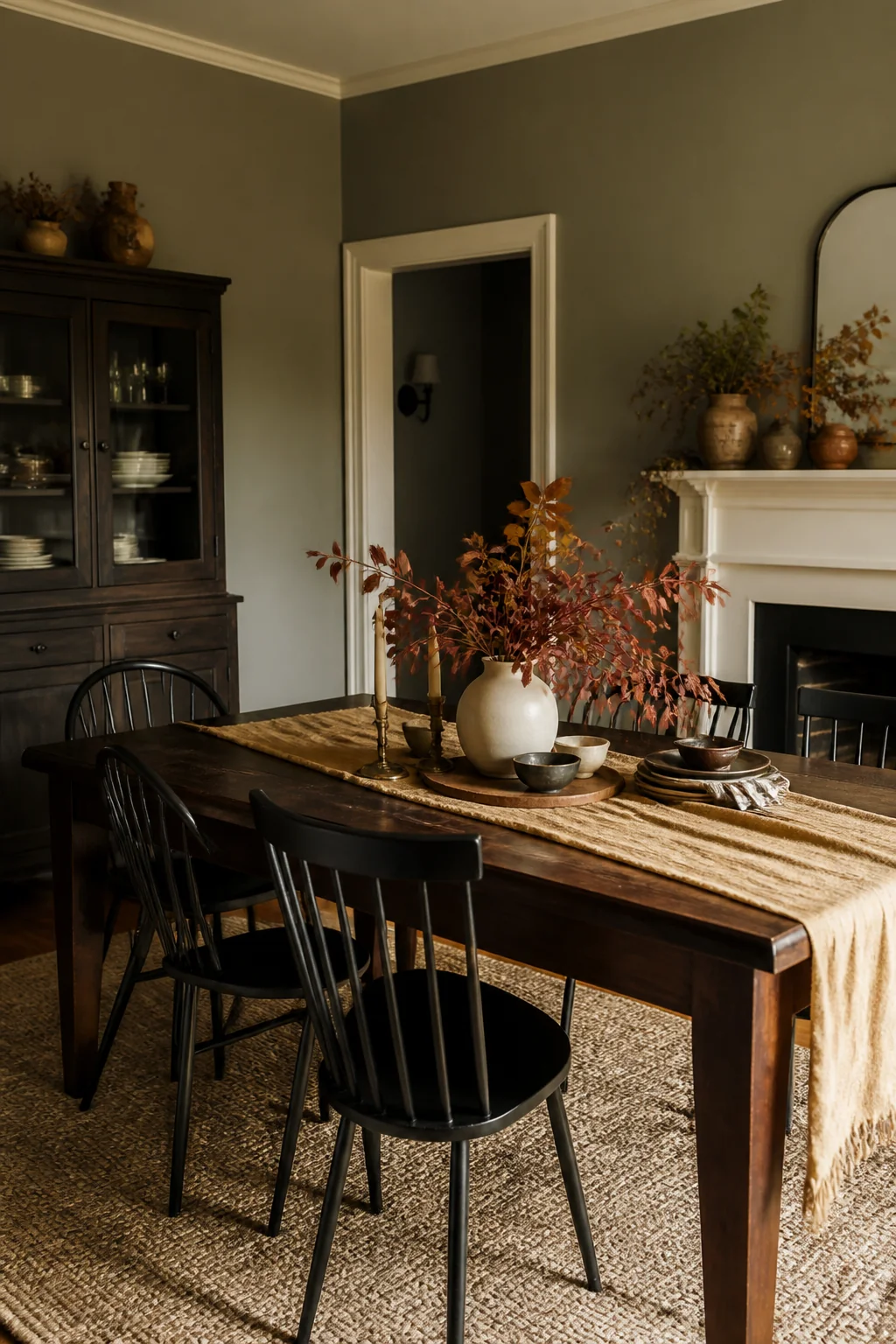
Start with your walls and table, not with accent pieces. These are the surfaces that set the whole feeling of a room. If your walls are neutral - cream, soft greige, pale taupe - you're working from a solid base. If they're already a stronger color, fall decoration becomes a balancing act, not a building block.
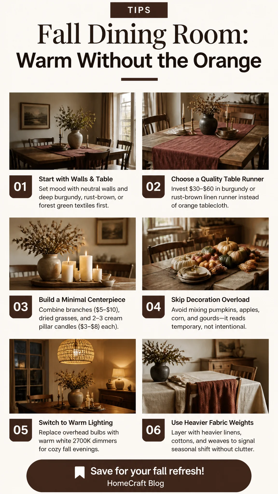
Your tablecloth or runner is where fall lives. Choose a linen, linen blend, or cotton weave in deep burgundy, rust-brown, forest green, or warm charcoal (around $30 to $60 for a quality table runner). These colors read as "we've moved into autumn" without the visual noise of orange. A burgundy runner under a white or cream table setting feels intentional and grown-up. Rust-brown works the same way - it's literally the color of dried leaves without looking like dried leaves.
Skip the orange tablecloth unless your dining room gets natural light from a south-facing window, where it'll actually glow. Otherwise it absorbs light and makes the whole room feel dim by 5pm.
Your Centerpiece Doesn't Need to Be Decorative
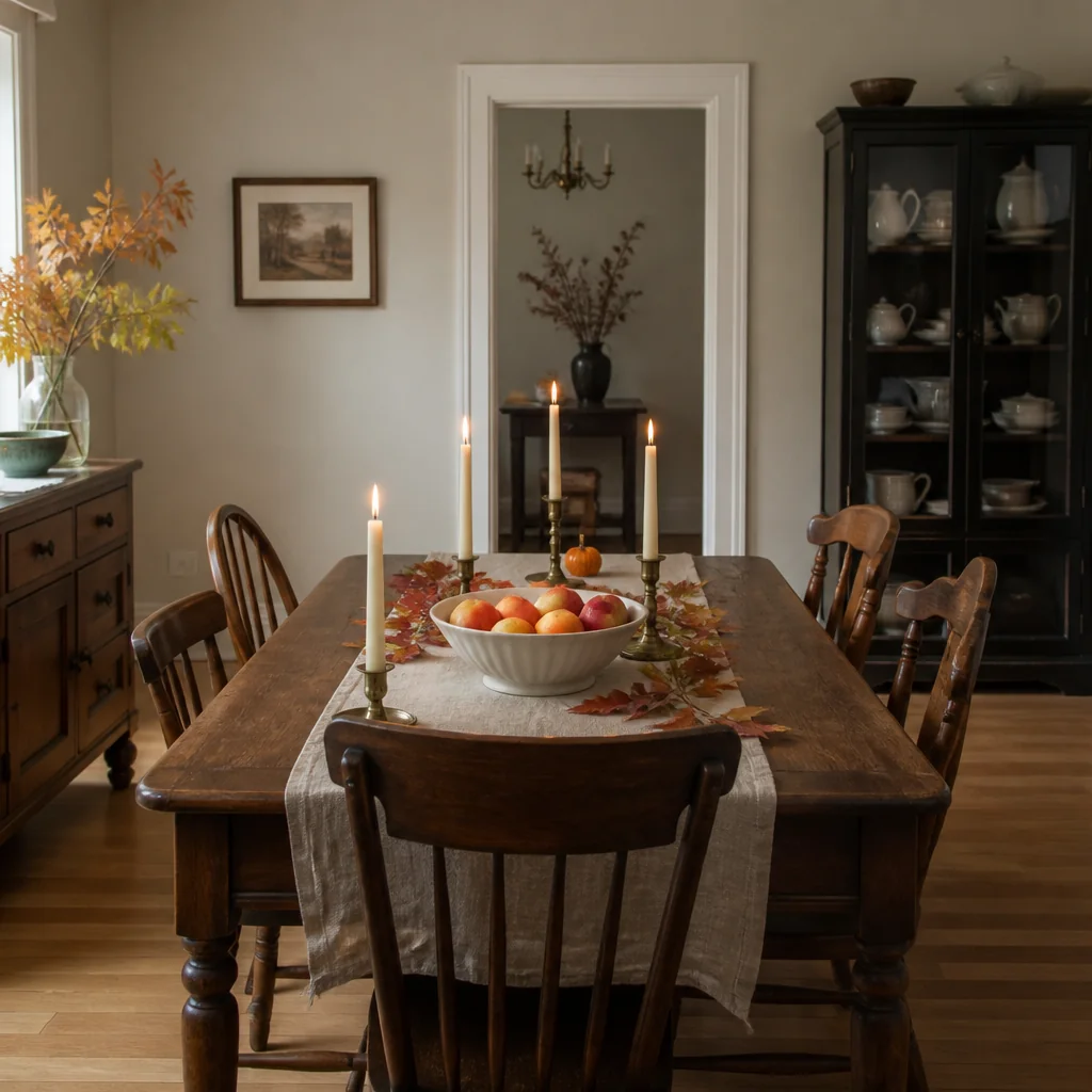
What sits in the middle of your table sets the tone for the whole season. A low arrangement of branches, dried grasses, and actual candles in glass holders works because it's real and sculptural, not cutesy. You can find branches outside (free) or at a farmers market ($5 to $10 for a bundle of interesting branches). Pair those with 2 or 3 pillar candles in cream or ivory (about $3 to $8 each) and you've made a centerpiece that looks intentional, costs less than $25, and works for the whole season.
What doesn't work: pumpkins mixed with apples mixed with corn mixed with gourds. That's decoration overload and it reads as temporary, not seasonal.
Lighting Matters - and It's Not About Adding Lights
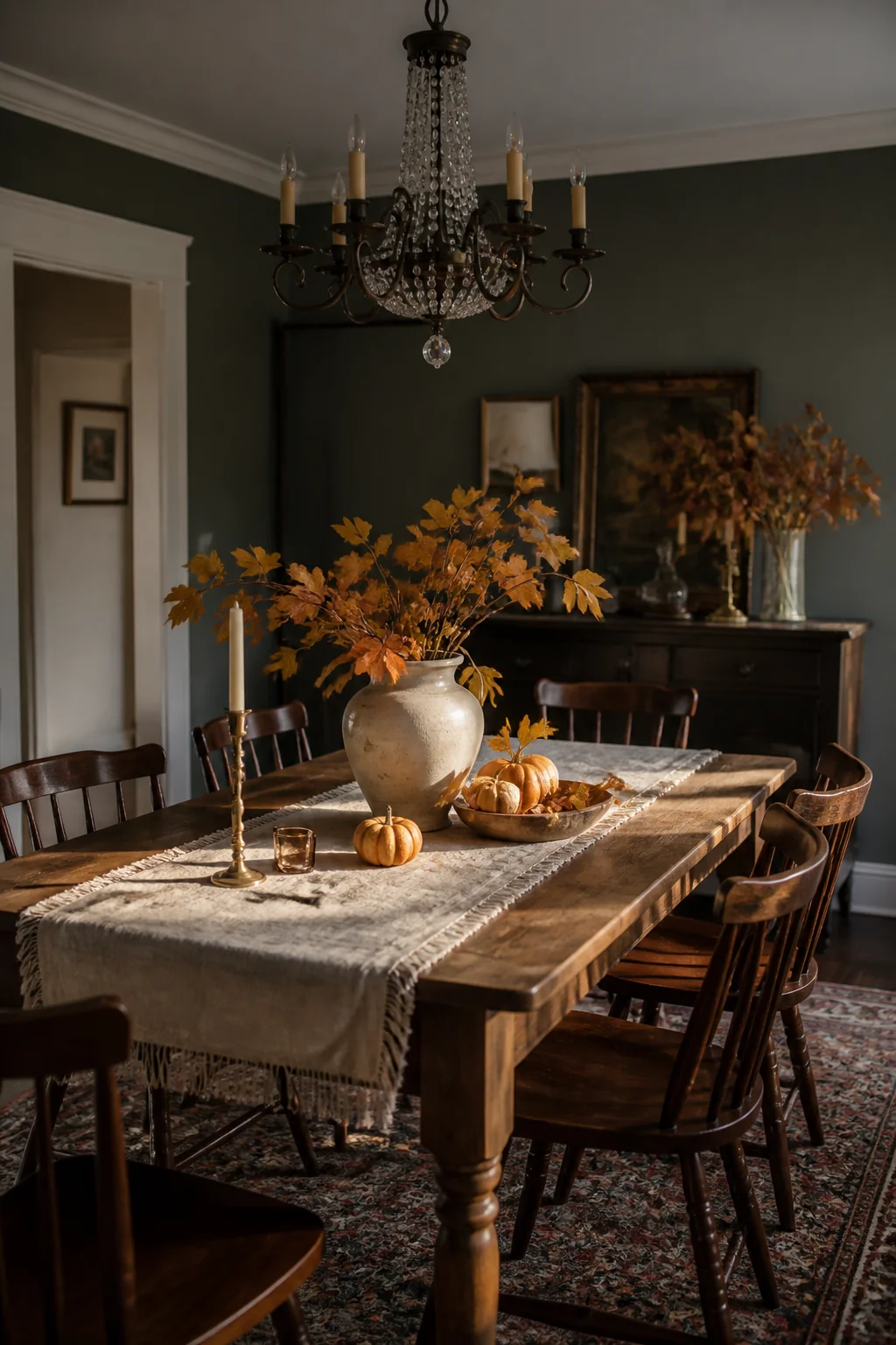
Fall means darker evenings. Your dining room probably relies on overhead lighting that's too bright and too white. Replace those bulbs with warm white (2700K) dimmable LEDs and you've shifted the whole feeling of the room without adding anything. It'll cost about $15 for a good set of bulbs.
If you have a chandelier or pendant lights, the bulb color matters more than the fixture. Warm white light makes warm colors look warmer and makes the whole room feel like evening is supposed to be there. Cool white light - the default in most dining rooms - fights against the season.
(String lights or extra lamps often feel like you're trying too hard, and they tend to cast weird shadows across the table when you're actually eating.)
Fabric Weight Signals Warmth
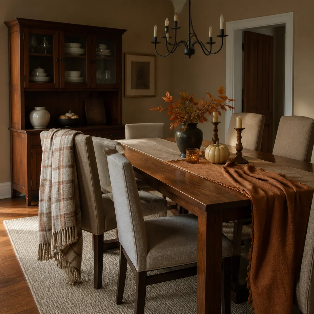
Your dining chairs probably have the same upholstery year-round. In fall, what reads as "cozy" is actually linen or cotton that feels heavier. If your chairs are upholstered in a lightweight cotton or linen, add a throw blanket draped over the back of one or two of them. Choose the same color family as your runner - that burgundy, rust, or forest green. It doesn't have to match exactly; it should echo.
A throw blanket also works because you can move it between rooms as the season shifts. It's not committed decor.
Artwork and Wall Accents Should Stay Subtle
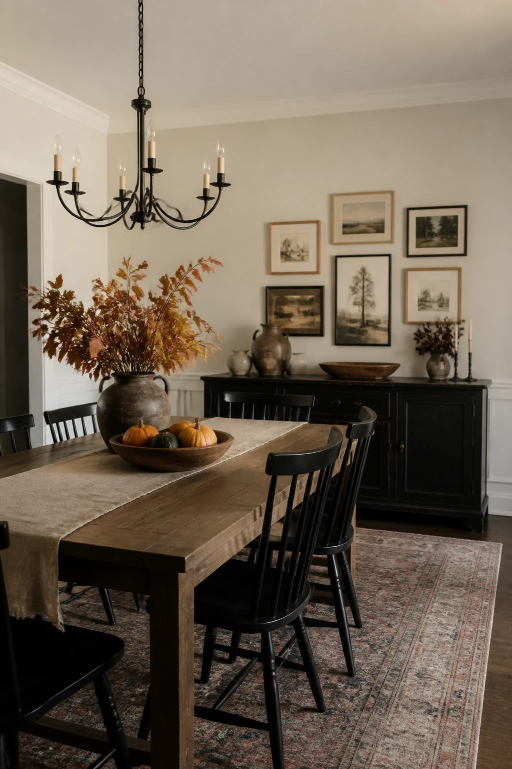
This is where people usually go overboard. Your wall doesn't need a new print or a gallery of harvest scenes for three months. If you're going to change anything on your walls, swap in one piece of artwork that happens to have a warm palette - maybe a landscape in ochre and deep green, or an abstract in burgundy tones. Limit it to one wall and one piece.
Better option: don't change the walls at all. Let the table, the light, and the fabric do the work.
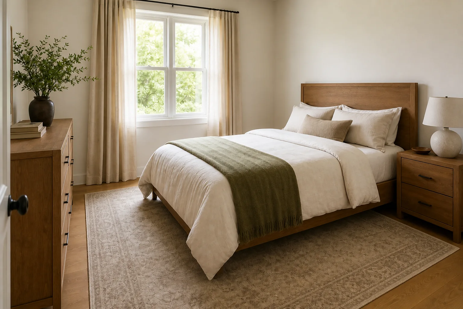
Your Dishes Matter More Than You Think
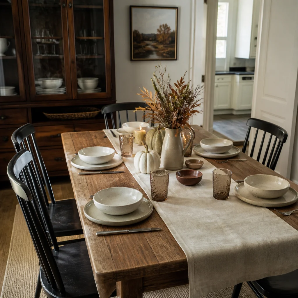
If your everyday dishes are white or cream, they stay. If they're pale blue or soft grey, consider pulling out warm-toned plates for the season - creamy off-white, warm taupe, or actual stoneware in rust tones (you can find place settings for $20 to $40 at most homewares retailers). Plates are functional and seasonal; nobody thinks you've overdone it because you switched to warmer ceramics.
Cloth napkins in the same color as your runner tie the whole table together without adding clutter. They cost about $2 to $4 each.
Window Treatments Can Shift the Light Without Shifting Everything Else
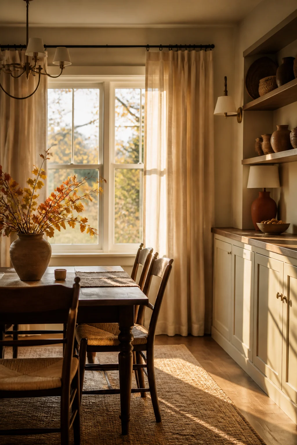
Heavy linen curtains or panels in warm taupe, dark rust, or charcoal will make your windows feel less bright and more intentional as the days get shorter. You don't need to install new rods; you can swap existing curtains if you have the storage space.
If swapping curtains isn't realistic, let the natural light shift do the work. September light is already different from July light.
A shorter, simpler approach: hang sheer panels in cream or ivory and leave heavier curtains tied back during the day. As the season deepens and you close curtains earlier, the layering feels intentional.
The One Thing Most People Miscalculate
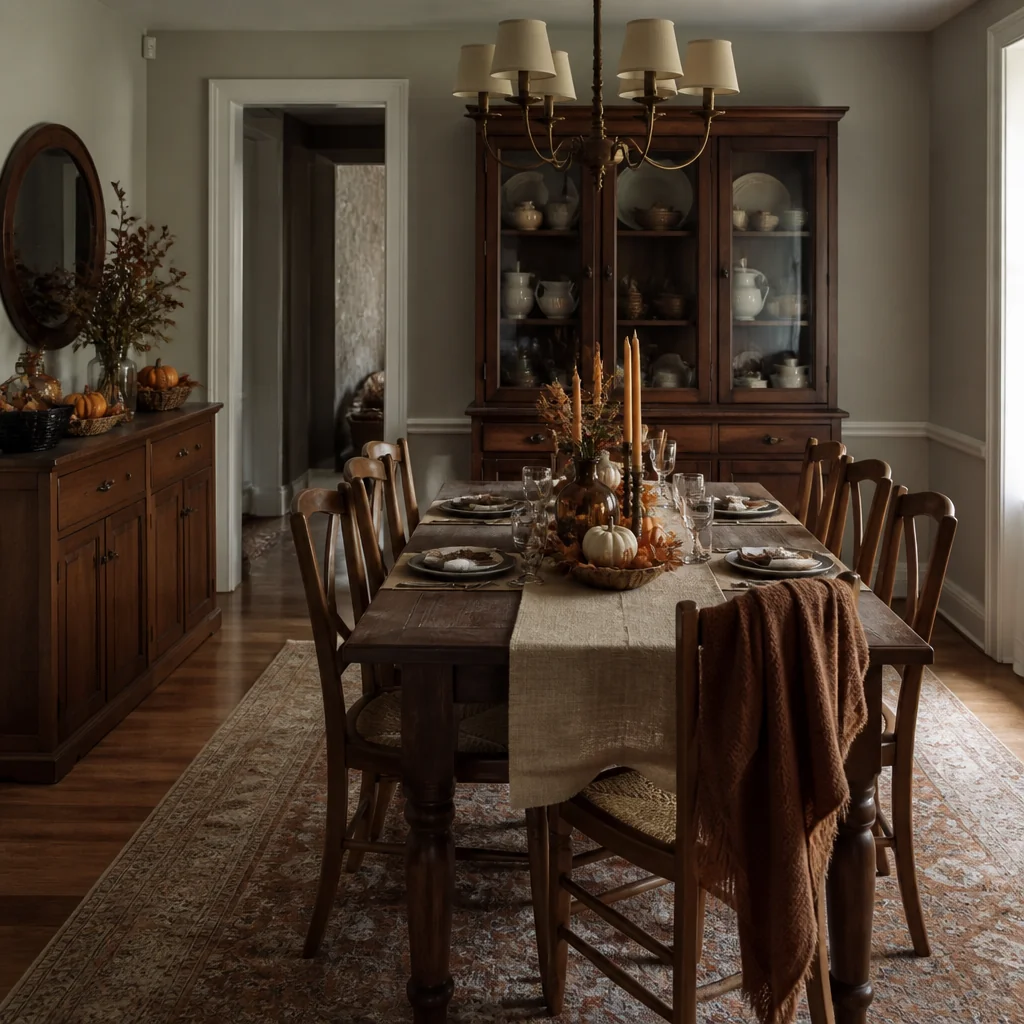
Repetition reads as restraint. If burgundy appears in your runner, your throw, your napkins, and your artwork, it looks like you chose a palette. If burgundy is everywhere mixed with orange, rust, mustard, and brown, it looks like you decorated your room by dumping a craft store into it.
Pick two colors for the season - say, burgundy and forest green, or rust and charcoal - and repeat them in different textures and items. Two colors feel deliberate. Four colors in a dining room under 200 square feet feel chaotic.
Save this for your next project
What you're giving up for this approach is the obvious seasonal marker. Your dining room won't scream "it's fall." What you're getting instead is a room that feels warm and intentional, a place where you actually want to sit for a whole season, and that's worth more than a brief rush of "oh, pretty" when someone walks in. The best seasonal decor is the kind your guests don't consciously notice until late November, when they realize they've never seen this room feel quite as right.
Ideas fade by Friday. A plan finishes the room.
You just read a full guide to your kitchen. Saving ideas will not change it; a plan will. The Home Decor Collection is every planning tool we make, for every room in the house, in one download, so the after photos below stop being other people's rooms.
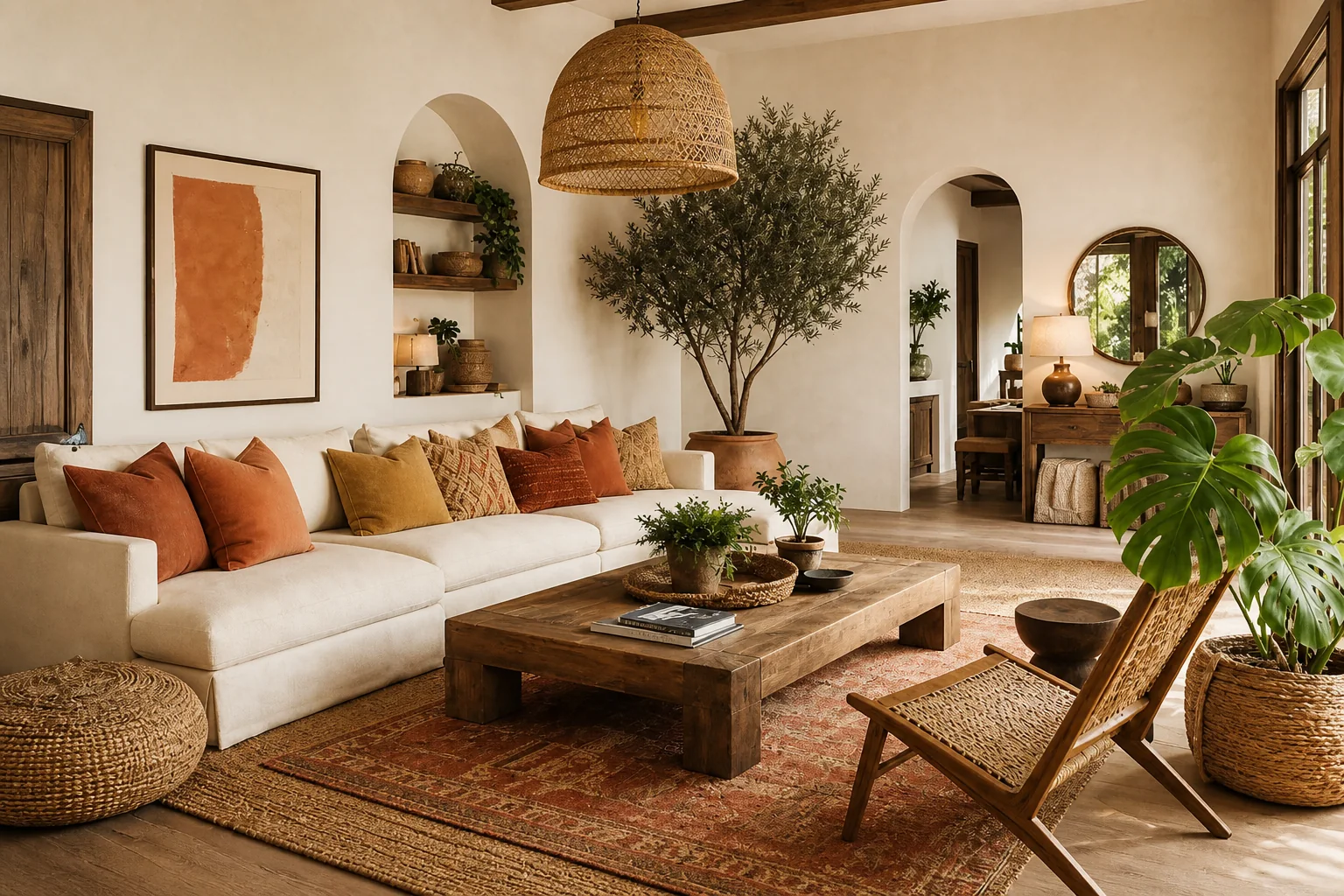
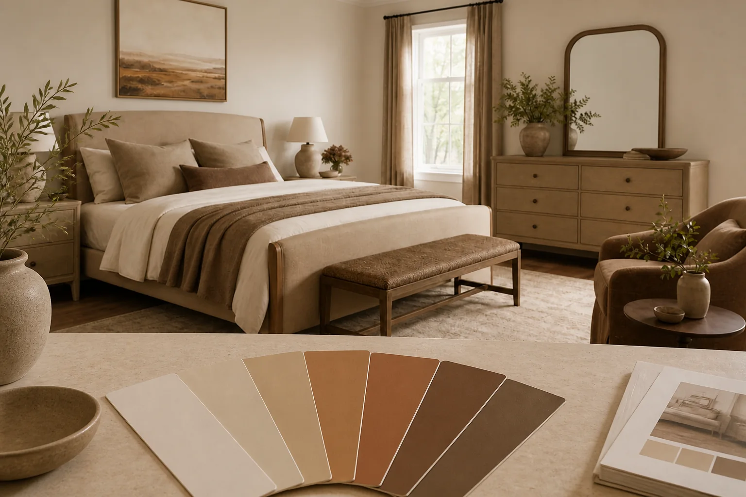
- Six room Style Kits, each with layout, palette and shopping list$114
- The Gallery Wall Studio: 200 prints + 15 measured layouts$29
- The Room Makeover System: 40 solved room layouts + workbook$29
- The Color Palette Handbook: 60 palettes shown in real rooms$19
- The Whole-Home Reset: 40 printable organizing checklists$19
- The Decorator's Cheat Sheets: the 40 measurements that matter$9
- All eleven products, bought separately
$219$97
A single hour with an interior designer costs more than the entire Collection, and this one keeps answering for every room you will ever decorate. Free updates included as the products grow. And if it is not for you, the 14 day money back promise means you simply get a refund.