10 Colorful Kitchen Ideas for Cabinet Doors and Breakfast Nooks
Paint your cabinet doors, pick a bold island, or add a colored nook bench. These colorful kitchen ideas suit tight spaces where a full-room shade won't work.
This post contains affiliate links. As an Amazon Associate I earn from qualifying purchases. If you buy through our links, we may earn a commission at no extra cost to you.
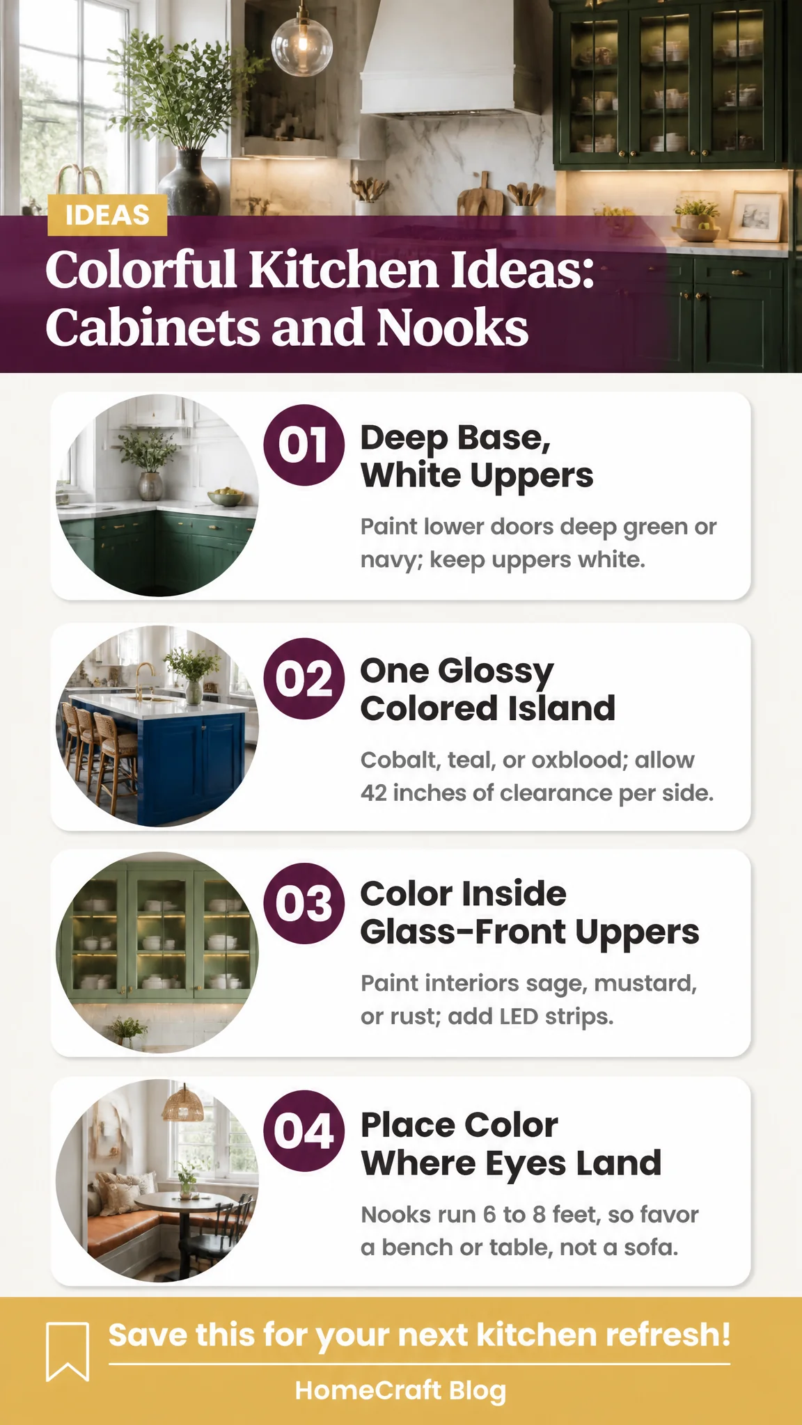
Most kitchens give you two places for color to live: the cabinet doors that fill the walls, and the breakfast nook tucked into a corner by the window. Floor space is tight. A typical kitchen run is about 10 feet of wall, and a nook often measures only 6 to 8 feet across before the table fills it. That footprint rules out painting the whole room in a saturated shade, and it rules out a big sofa in the nook. What it leaves you is color on surfaces your eye already lands on: doors, one island, a bench, a table. The ideas below work inside those limits, and each one explains why the color behaves the way it does.
Free printable kit
Finish the wall above your bed this weekend
- 10 boho prints in terracotta and sage
- Layouts for full, queen and king beds
- Frame sizes and spacing worked out
Plus our emails with ideas and occasional shop offers. Unsubscribe anytime. Privacy
1. Paint the base cabinets deep and keep the uppers white
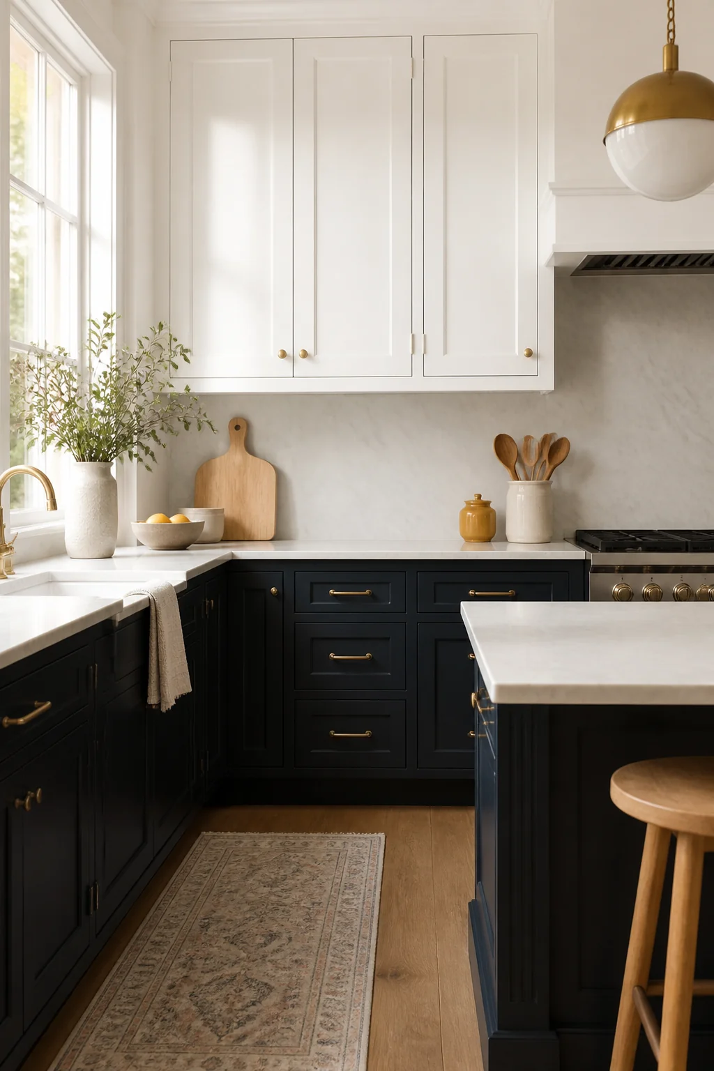
Deep green or navy on the lower cabinets, with white uppers and walls, gives the kitchen a grounded base and a light top. The color sits at counter height, where it frames your work and your hands, and the white above keeps the ceiling line open. Brass or matte black pulls look right on that combination. To get it, paint only the base doors and drawer fronts, and choose a satin or semigloss cabinet enamel because those surfaces get wiped every day. Keep the upper cabinet bottoms about 18 inches above the counter so the dark band reads as deliberate and not as leftover paint. (If the cabinets were painted before 1978, test for lead before you sand.)
2. Glossy finish on one colored island
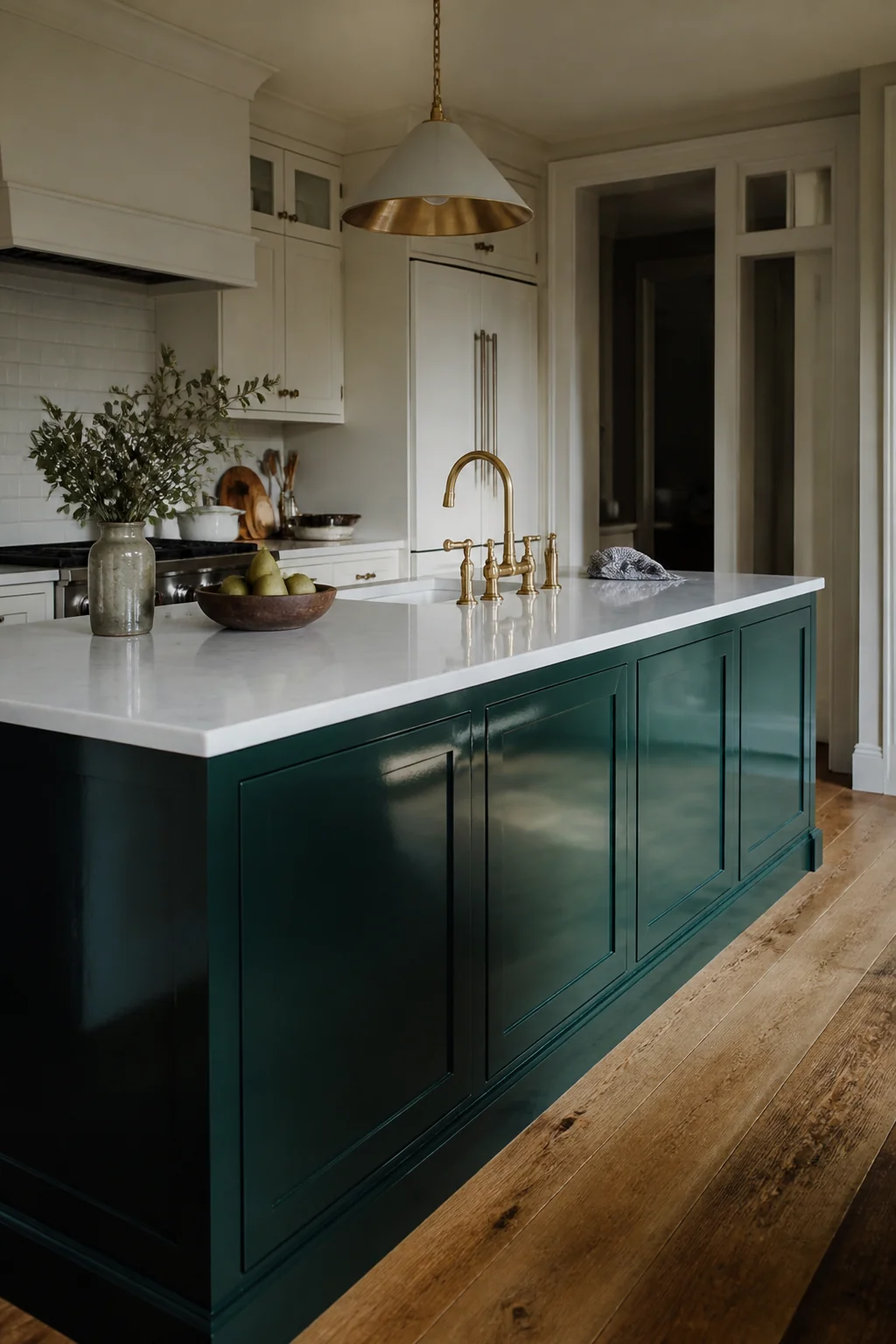
A single island in cobalt, teal, or oxblood reads as a piece of furniture, and that is the reason it works. High-gloss paint catches light from the window and the pendants, so the color shifts through the day while the matte perimeter stays quiet. A 4 by 8 foot island needs about 42 inches of clearance on each side for two people to pass with a drawer open, so measure that before you commit. Sand and prime first, then use a cabinet enamel with a gloss rating and a hardened top coat on the countertop-level surfaces. Gloss shows every fingerprint and every ding, so this look suits a kitchen where someone is willing to wipe the island down after dinner.
3. Colored interiors behind glass-front uppers
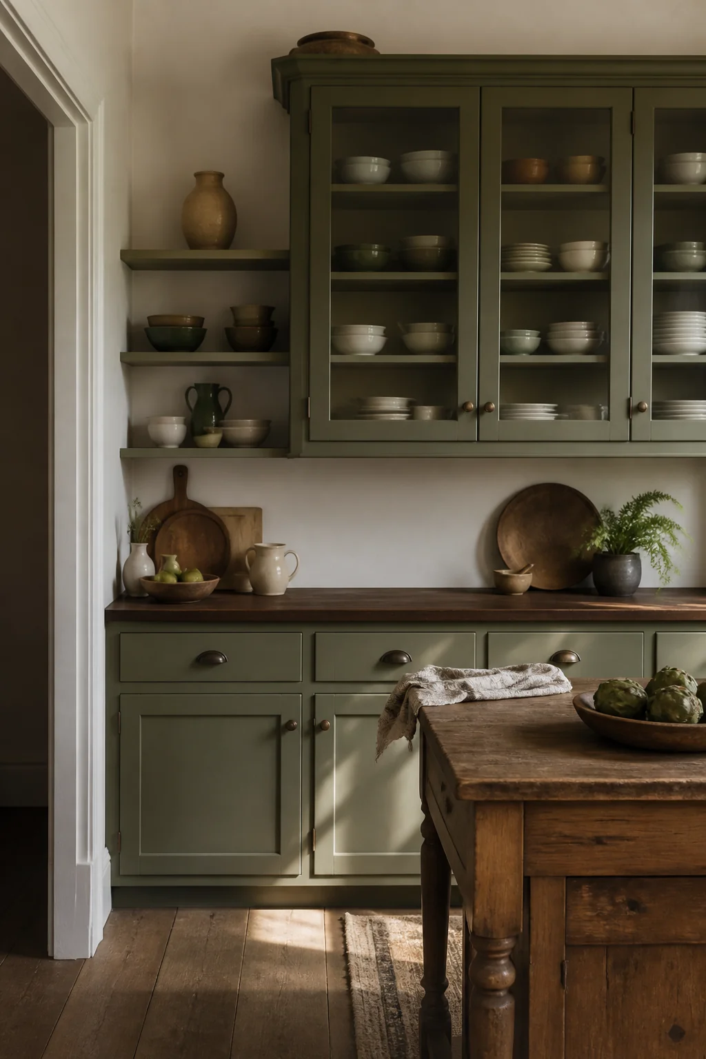
Two upper cabinets with glass doors can hold colored dishes, and the color behind them does most of the work. Paint the interior back panel and the shelf edges in sage, mustard, or a soft rust, then stack plates in mixed glazes. The room stays calm when the doors are closed, and when they open the color comes forward in a band that looks collected. Use plug-in or battery-powered LED strips to light the shelves. If you want hardwired lighting, have a licensed electrician run it, because that work belongs with the breaker off or a professional on the job. Keep the dishes varied in shade. A stack of one color looks like a display, and a mix looks like a kitchen someone uses.
4. Two colors on each shaker door
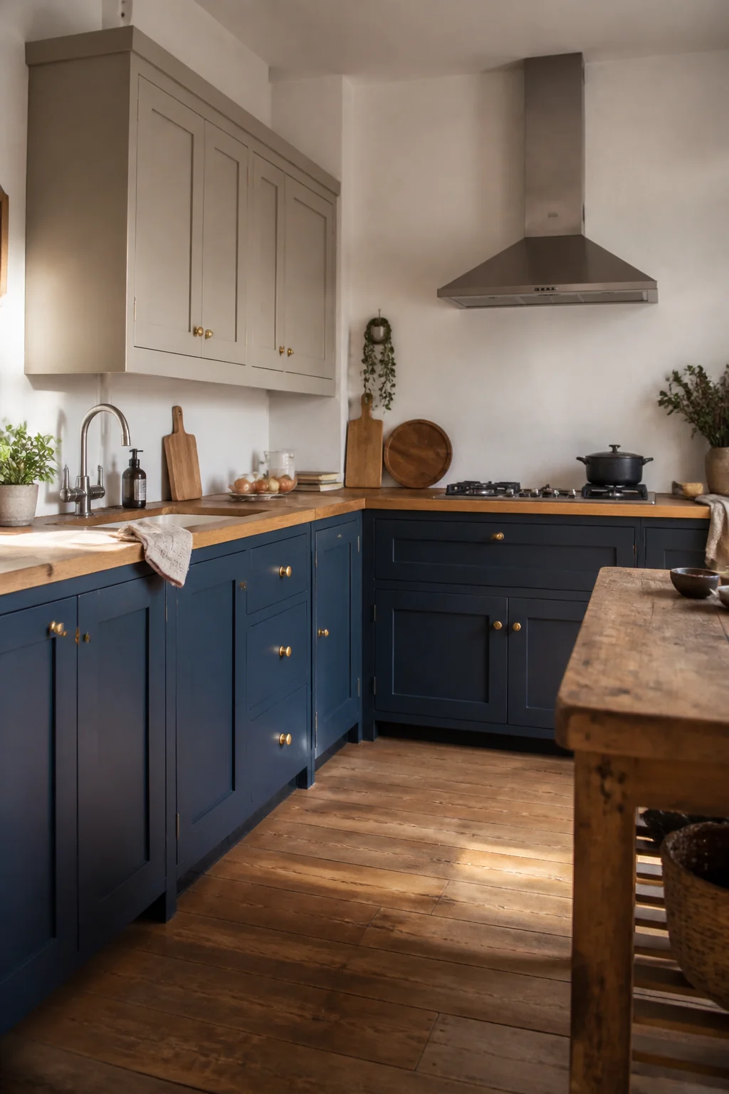
Paint the recessed center panel one color and the frame another, such as a warm white frame around a sage panel, or a navy frame around a rust panel. The contrast creates a border that reads as joinery, which gives flat doors more depth than a single coat. Remove the doors if you can and lay them flat, because tape bleeds on vertical surfaces and the lines come out wobbly. Paint the panel first, let it dry, then do the frame with a 2 inch angled brush. Light colors over dark bases need two coats of primer, so check the color card against the sample before you start. This works best on doors with a clear panel, and it looks busy on slab-style fronts.
5. Bright color inside the drawers and behind open shelves
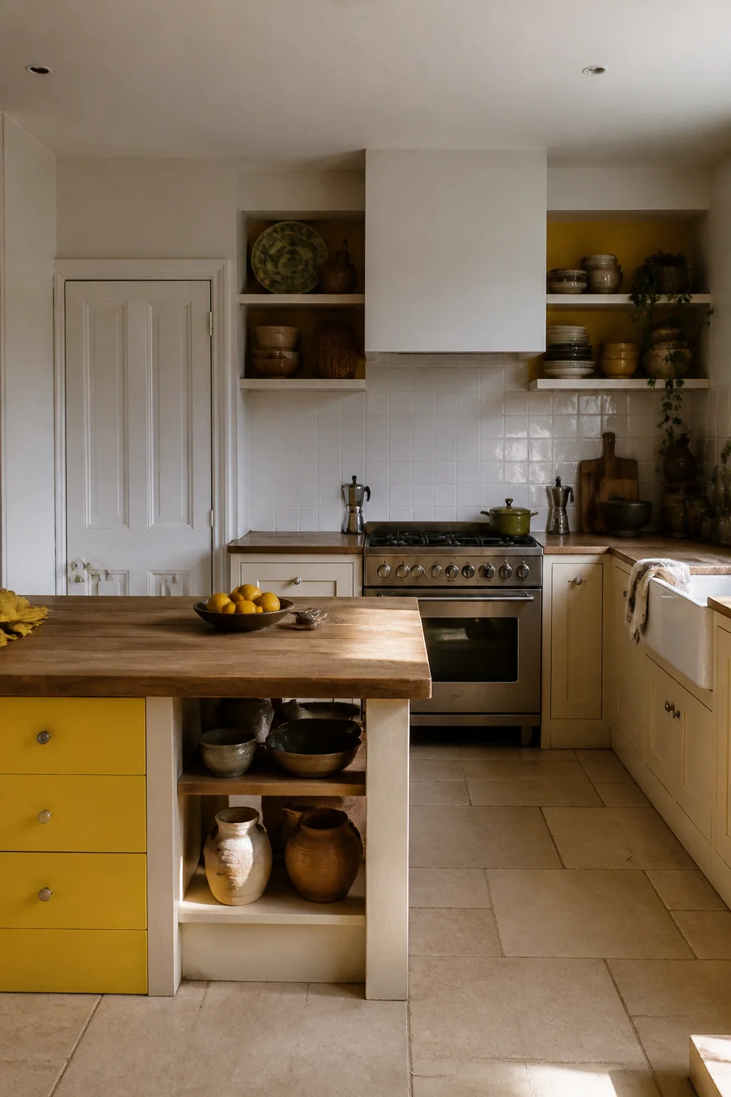
Color that shows up when the doors open feels like a surprise you planned. Turquoise drawer interiors, terracotta backboards on open shelves, or a deep blue lining inside the pantry door all repeat the room's palette in places you see only briefly. Open shelves cast a shadow, so a dark backboard looks richer than the same shade on a wall. Cut the backboard from 1/4 inch plywood, paint and lacquer it before it goes in, and keep the shelf edges in a neutral so the color stays behind the dishes. Choose a washable finish for drawers, since they take heat and grease. Avoid painting the inside of a cabinet in a shade that fights the dishes you already own.
6. A banquette in saturated velvet or vinyl
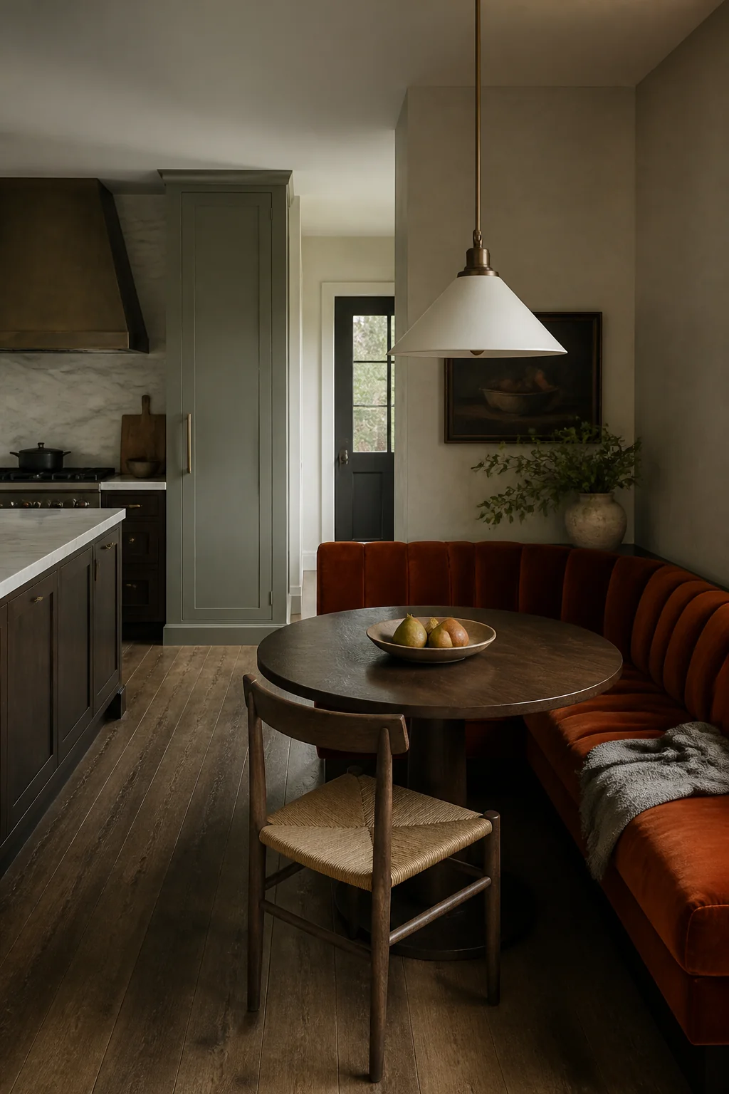
An L-shaped banquette gives the nook one large shape, and a saturated fabric on it reads as a single warm mass. Emerald velvet, mustard boucle, or a glossy oxblood vinyl works well against a white table and a light wall. The dimensions matter more than the color. Seat height should sit around 17 to 18 inches, the seat depth around 18 inches, and the table at about 30 inches tall with 24 inches of clear space between the table edge and the wall behind the bench. A 3 inch foam cushion feels hard after a few meals, so 4 inch foam at a firm density is the safer choice. Velvet shows crumbs and pet hair more than vinyl does.
7. Colored glass pendants in a row over the table
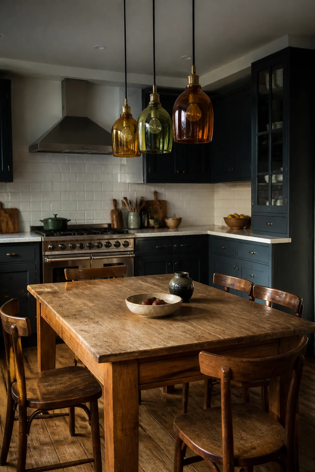
Three pendants in amber, cobalt, or green glass hung in a line over a round table make the nook feel like its own room. Colored glass casts a warm tint onto the table surface and the wall behind it, so the color spreads a little past the fixture. A line of three reads as rhythm, and one fixture alone reads as an afterthought. For a 36 inch round table, the bottoms of the shades should sit about 30 to 36 inches above the tabletop, and spacing around 24 inches between centers keeps them from crowding. Hardwired fixtures need the breaker off or a licensed electrician, and you should confirm the box can hold the weight before you hang heavy glass.
8. Chairs in four different painted shades
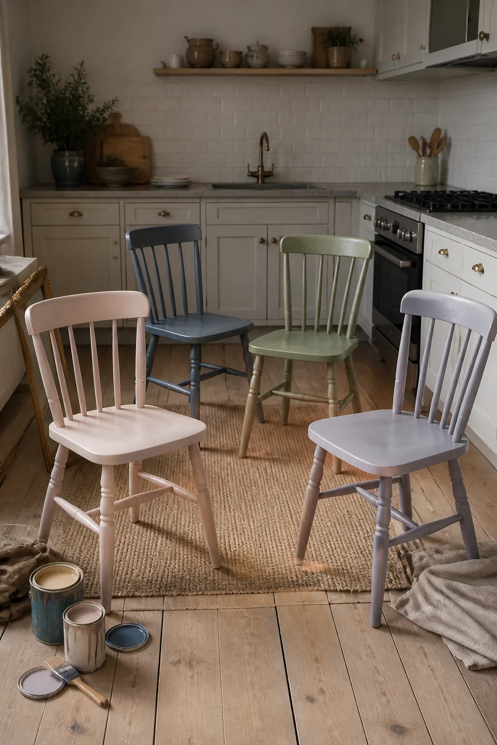
Four chairs that share a shape but differ in color, such as butter yellow, sage, sky blue, and ink, look collected rather than random. The repeated frame does the work, and the color changes give each seat its own character. Keep the seat height the same across all four, around 17 to 18 inches, so nobody sits at a different level than the others. Use one finish on every chair so the sheen matches even if the hues differ. Mixing shapes is where this look falls apart, because different backs and legs make the set look like a yard sale. Spray paint outdoors or with the windows open, and lay oily rags flat outside to dry before you throw them away.
9. Washable patterned paper on the nook wall
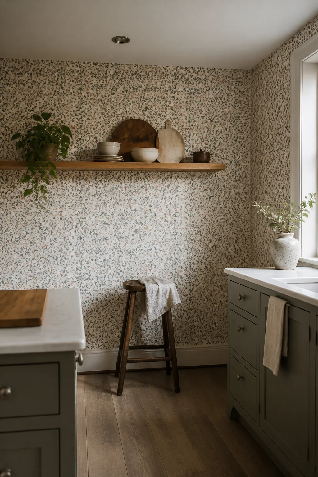
One wall behind the banquette can carry a large botanical or geometric print in green and pink, and the rest of the nook stays plain. Pattern on one wall sets the scale of the room, and limiting it to that wall keeps the nook from feeling busy. Choose a scrubbable vinyl or a wallpaper rated for kitchens, since grease and steam will reach it. Standard roll widths in the US are about 20.5 inches, so measure the wall width and plan your seams so the pattern lands cleanly around the window trim. A large repeat looks dramatic on a wide wall but overwhelms a narrow nook, so keep the print smaller where the wall is under 6 feet across.
10. A single bold tile band behind the range
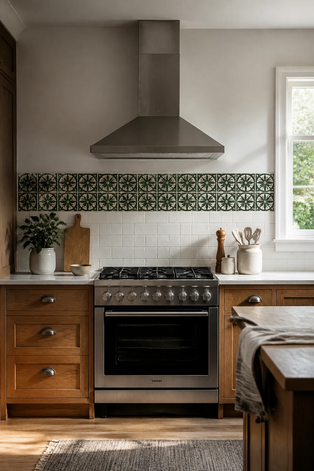
A strip of cobalt, emerald, or glazed green tile covering only the wall behind the range makes the cooktop the focal point. Use 4 by 4 inch tile or 3 by 6 inch subway tile, and run the band from the counter up to the bottom of the upper cabinets, about 18 inches high on a standard layout. The band is narrow enough to read as deliberate, and the rest of the backsplash can stay white or left blank. Grout in a mid gray keeps the color clean and does not compete with the tile. Seal the grout after it cures, and keep the tile at the same height as the range hood so the lines align.
Take the guide with you
A colorful kitchen asks you to give up the easy resale neutral that lets every future change blend in. Color on the base cabinets, a bench, or one wall commits the room to a palette, and repainting or replacing those pieces costs more time than a white wall ever would. The trade is worth it when the color sits where your eye already goes: the counter you work at each morning, the table where you eat, the back of the shelf you open every day. Those are the places a room earns its personality, and they are small enough to change when your taste does.