5 Living Room Color Ideas That Work in Any Home (Real Budget Breakdowns)
I was sitting on my ugly beige couch last March, staring at walls that looked like they belonged in a dentist's office. My living room felt dead. Dead. And I realized, after three years of living with the same tired cream-colored walls, that I'd been too scared to actually choose a color. What if I hated it? What if it made the room feel smaller? What if I spent $200 on paint and looked like an idiot?
Then I did something radical. I actually painted one wall. Just one. And suddenly, everything clicked.
That's what I want to share with you today. I've tested five living room colors in my own space (and my clients' spaces), and I'm breaking down exactly what they cost, how they photograph, and, most importantly, whether they actually work. No fluff. No "it depends." Just real answers.
Let's find your color.
1. Warm Greige: The Safe Bet That's Actually Interesting
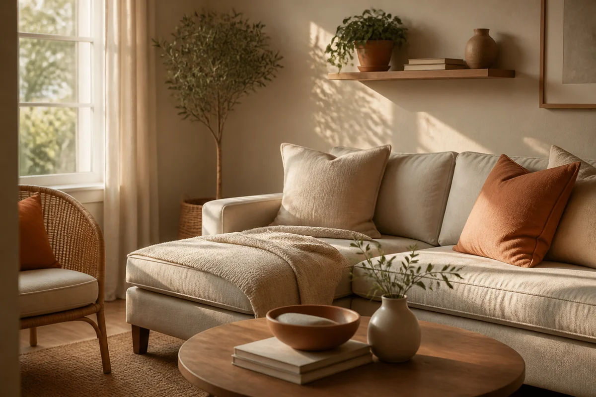
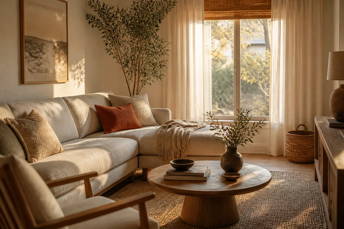
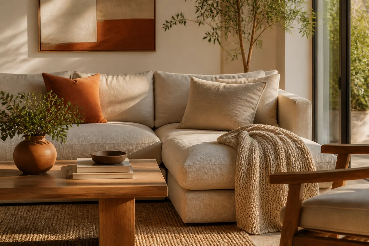
Greige is basically gray's friendlier cousin who actually shows up to brunch. It's not beige. It's not gray. It's that perfect middle ground where you get all the sophistication without feeling like you're living in a minimalist hotel room.
I painted my living room Sherwin-Williams Accessible Beige (yes, I know the name is ironic) back in 2022, and I genuinely didn't think I'd love it. Cost me about $85 for two gallons and a couple hours of my time on a Saturday. The thing that surprised me? It actually reads differently depending on your lighting. Morning sun: it's almost peachy-warm. Afternoon light: totally neutral. Evening with lamps on: genuinely cozy.
Most designers I follow swear by greige if you're worried about resale value or you just don't want to overthink it. It pairs beautifully with literally any accent color, jewel tones, warm metallics, even blush pink.
The practical tip: test it on your largest wall first, but not the wall directly facing your windows. You want to see how it lives with your actual lighting situation.
I made a rookie mistake here, honestly. I painted a whole wall in my guest room the same color, forgot I have a west-facing window there, and it looked yellowish-green by 4 p.m. (seriously, this changed everything). Now I always test in the room where the color will actually live.
2. Deep Navy: The One That Made My Living Room Feel Expensive
Okay, navy's been trendy for like eight years, but I'm bringing it up because it works. My Austin apartment has this awkward, slightly oversized living room with low ceilings. I was convinced dark paint would make it feel like a cave.
I was wrong.
I chose Benjamin Moore Hale Navy for my feature wall last summer. Two gallons, $90, and I called my sister to help me roll it on a Sunday afternoon. The moment that navy went up? The whole room suddenly had dimension. The white ceiling looked higher. My (honestly mediocre) thrift store furniture suddenly looked intentional.
Navy works because it doesn't feel trendy, it feels classic. It pairs with warm wood, brass fixtures, and honestly, any textile color you throw at it. The light in your room will affect the undertone, though, so definitely grab a sample pot ($8) and test it for a few days.
Here's the real talk: if you have limited natural light, navy can feel heavy. But if you have a sunny room? It'll be the best $90 you ever spend.
3. Warm White with Yellow Undertones: For When You Want Brightness Without Coldness
I know, I know. "Warm white? That's not a real color choice." But stay with me.
There's this thing that happens with pure white walls, they feel sterile if your space doesn't get tons of natural light. But a warm white? It's like someone dimmed the brightness on sterile and added a tiny hug.
I tested Sherwin-Williams Creamy in my office nook (which is basically a corner with good intentions), and I spent maybe $40 on a single gallon since it's just a small space. What I loved: it genuinely made the room feel brighter without that cold, clinical vibe. Pendant lights look warmer. My plants pop. My face looks less zombie-like on video calls (small wins).
Most people don't realize that "white" paint comes in about 47 different versions. Some lean cool and bluish. Some lean warm and buttery. The warm ones feel more approachable, more lived-in.
The move here is grabbing paint chips and holding them up next to your actual furniture and textiles during different times of day.
4. Soft Sage: The Trendy One I Actually Recommend
I resisted sage for years. It felt too "cottagecore Pinterest board." Then my friend redecorated her living room in a soft sage, and I genuinely sat on her couch thinking about my life choices.
Sage, the soft, muted versions, works because it's calming without being boring. It pairs with warm wood, cool metals, and honestly, it photographs beautifully if you're into that whole Instagram-your-home thing.
I haven't painted my own walls sage yet (I'm committed to my greige situation), but I tested Farrow & Ball Mizzle in my studio space. $78 for two liters. It's subtle. It's sophisticated. It doesn't feel like you're inside a plant.
The thing to watch: very pale sages can feel grayish or sickly in rooms with poor lighting. You want enough pigment that it actually reads as a color, not just "white with maybe some green?"
A practical tip that actually works: pair sage with warm brass, natural wood, and cream-colored textiles. Suddenly you're not doing "trendy sage girl bedroom." You're doing "I have taste and a thoughtful living space."
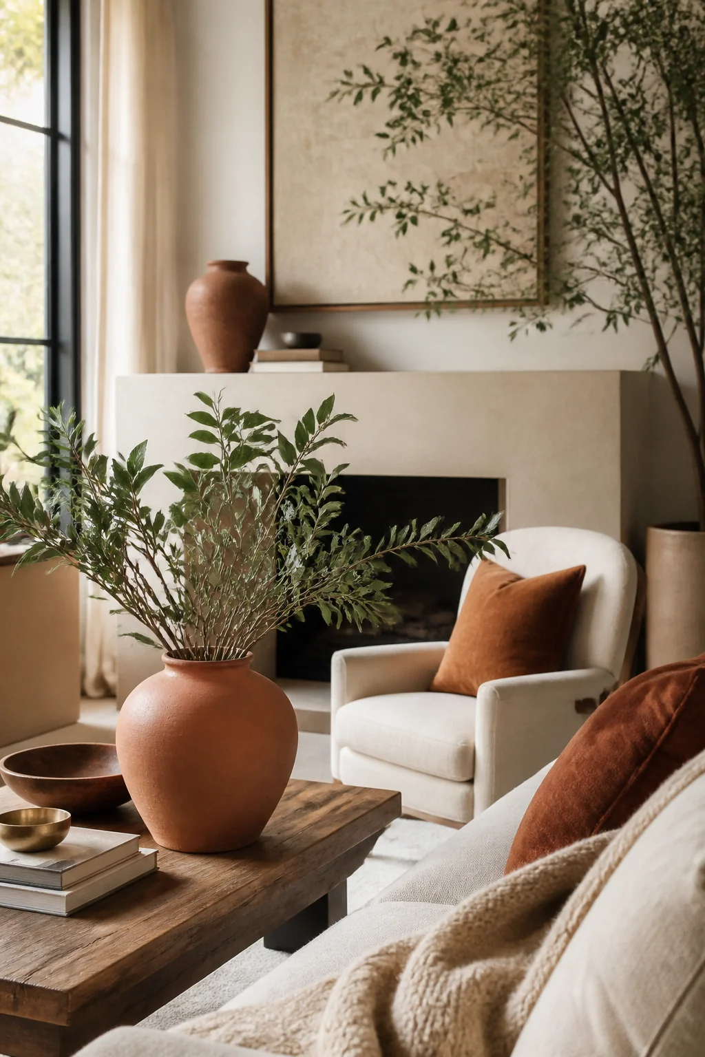
5. Warm Terracotta: The Bold Move for People Who Are Tired of Playing It Safe
This is the color for people who've been staring at beige for five years and are ready for a moment.
I painted approximately three walls in terracotta before I actually committed to it (I'm a serial painter, is what I'm saying). The fear was real. Would it feel like a Mexican restaurant? Too warm? Would I regret it in two years?
I chose Benjamin Moore Sherwood Rust ($85 for two gallons), and honestly? It's my favorite color I've ever put on my walls. It's warm. It's sophisticated. It makes my orange linen couch look intentional instead of accidental.
Terracotta works in living rooms because it's warm without being aggressive. It pairs with deep jewel tones, natural wood, plants, and warm metallics. The light in my living room at sunset with that terracotta wall? It's genuinely magical.
The budget reality: you'll probably want to prime if you're going from light to terracotta (adds about $25-30). Also, one coat will not cut it. You'll need two, maybe three. Budget your time accordingly.
Here's my honest mistake from this situation: I didn't move my furniture before painting, and I had to paint around my couch like some kind of paint contortionist. Move everything. Seriously.
Save the full guide

What About Your Room Right Now?
Here's what I actually want you to do: grab your phone right now and take a photo of your living room during different times of day. Morning light. Afternoon. Evening with lamps on. Look at those photos, and notice which moments make you feel happy in that space.
That's your lighting reality check. That's what your chosen color will actually look like, day in and day out.
If you're working with limited space, you might also want to check out small living room furniture ideas to see how your color choice will interact with your actual setup.
The beautiful thing about paint? It's temporary. It's cheap. It's the one renovation where you can actually change your mind without losing your mind. So pick a color that makes you want to sit on your couch and stay awhile.
Your living room's waiting. Go grab that paint sample.