I Tried 11 Gallery Wall Ideas, Here's What Actually Stuck
Last spring, I stood in front of my living room wall with a level in one hand and a frame in the other, absolutely frozen. I'd bought twelve different frames from three different stores. My Pinterest board had 247 pins. And I still had no idea what I was actually doing.
Sound familiar?
Gallery walls sounded so simple when I first started reading about them. Just hang some art. Make it look intentional. But after spending three months (yes, three) rearranging, rehanging, and occasionally swearing at drywall anchors, I finally figured out what actually works. I'm talking real results, the kind where people actually stop and ask about your wall instead of just glancing past it.
Here's what I learned from all those attempts.
Start with a Theme, Not Pinterest Perfection
Here's the thing nobody tells you: looking at inspiration online will paralyze you. I know because I lived in that paralysis for weeks.
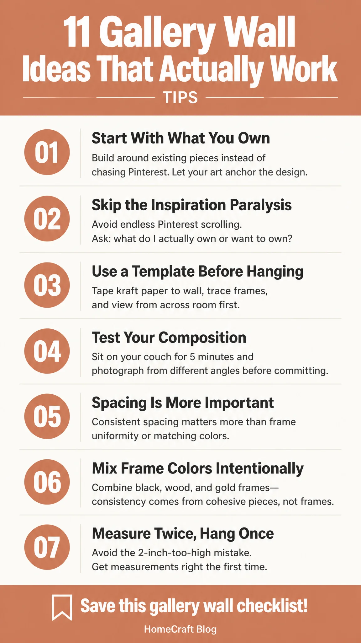
I'd find a gallery wall I loved, screenshot it, then realize it had eight frames I couldn't find in Austin, and they cost $800 total. That's when I switched tactics completely. Instead of chasing a specific aesthetic, I asked myself one simple question: what do I actually own or want to own?
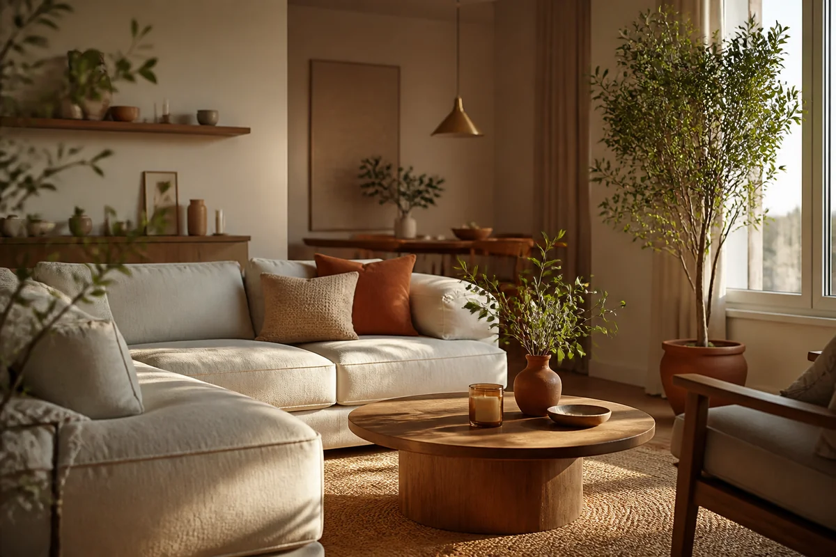
For my living room, I had three original paintings from local Austin artists, two black-and-white photographs from my travels, and space for maybe four more pieces. That became my anchor. Everything else had to work with that foundation, not against it.
Most designers I follow say the same thing in different ways: constraints actually create better design. So instead of feeling limited by what I had, I leaned into it. Started there. Built outward. That single shift made everything easier.
I ended up with a mix of frame colors, some black, some wood, one gold, and it worked because they were all my things first.
Measure Twice, Hang Once (I Didn't)
Yeah, I made mistakes.
The first time I hung my gallery wall, I didn't measure anything. Just eyeballed it. Got halfway through and realized the whole thing was sitting two inches too high. Had to take everything down and start over. Filled the wall with little holes I had to spackle later. Super fun times.
This time, I actually used a template. You can download free ones online, or honestly, just tape kraft paper to your wall, arrange your frames on the paper first, and trace around them. Tape the paper up. See how it feels from across the room. Sit on your couch and look at it for five minutes. Does your eye move naturally through the composition?
Take a photo from different angles too. Your phone camera catches things your brain glosses over.
The spacing matters way more than I thought. I kept everything about 2-3 inches apart consistently. It created this rhythm that actually looked intentional instead of random.
Once I committed to the layout on paper, hanging took maybe thirty minutes. Not three hours of remorse.
Mix Frame Styles (But Not Too Many)
This is where I went slightly feral my first attempt.
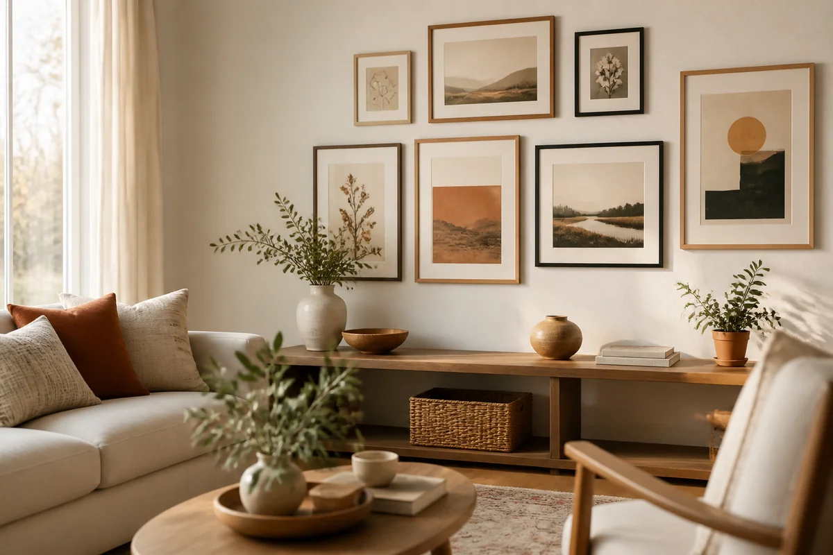
I had gold frames, black frames, natural wood, white frames, and even one metallic silver frame mixed together. It looked like a thrift store exploded. So for round two, I limited myself to three frame colors maximum, and ideally, they had to repeat at least twice each so your eye didn't get confused.
My final wall has mostly black frames with two natural wood ones (which echo the gallery wall ledge below it), and one painted frame in deep teal that ties to my throw pillows. That constraint actually made it better. Less is doing more heavy lifting.
You can vary the frame styles within colors, though. Thin black frames next to thicker black frames totally works. Mix open-back designs with traditional closed frames.
The real rule? If it makes your eye stumble when you look at the arrangement, it's probably too much variation.
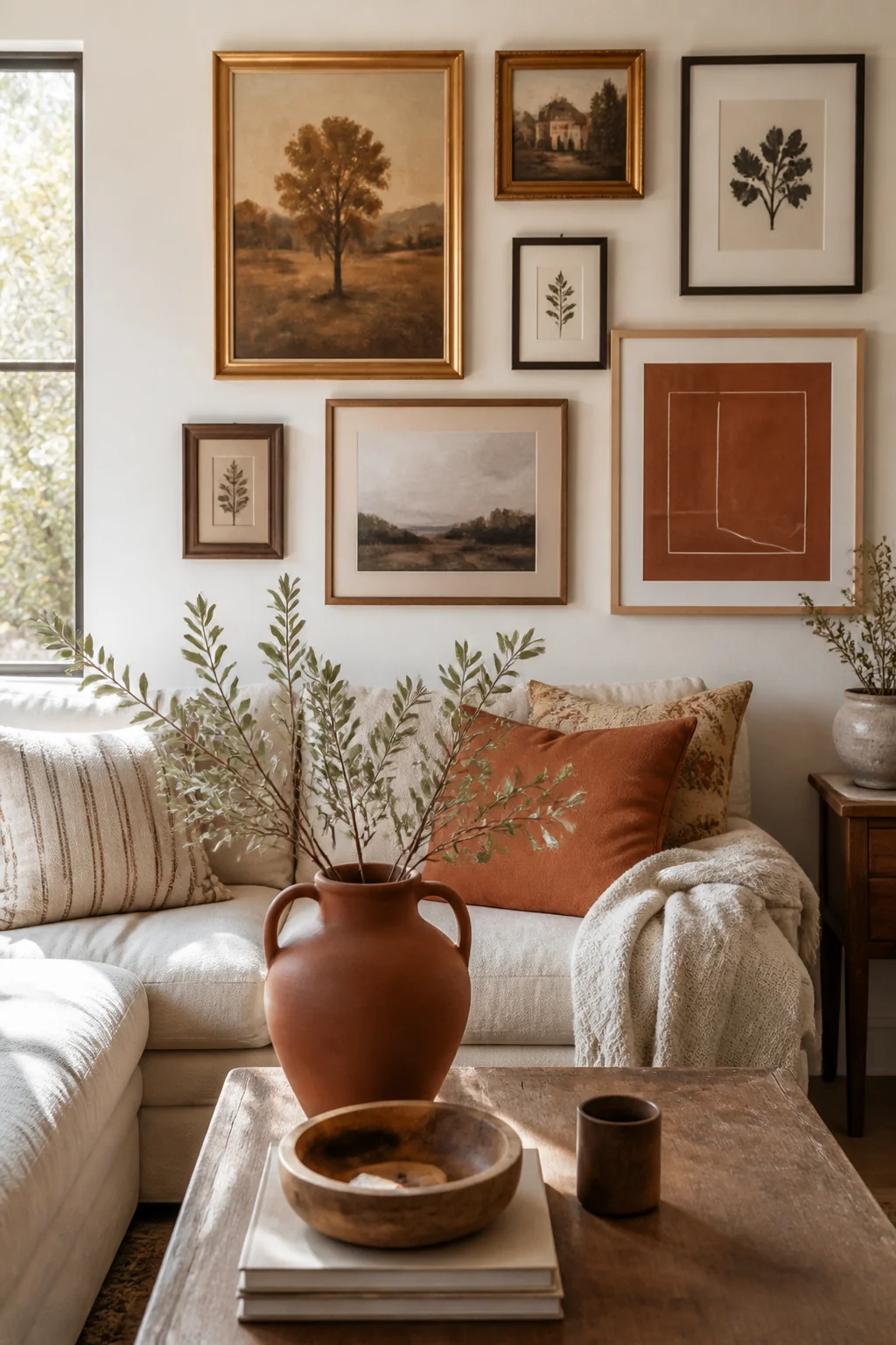
Consider a Gallery Wall Ledge (Seriously, This Changed Everything)
I added a simple floating ledge beneath my gallery wall, and I'm not exaggerating when I say it completely changed how the whole thing functioned.
Here's why: a ledge gives you flexibility. You can rotate out smaller pieces. Add seasonal elements. Plant a tiny succulent in spring. It breaks up the wall visually so it doesn't feel like one massive heavy block of art. Plus, you can actually live with your gallery wall instead of being married to whatever you hung permanently.
The ledge cost me about $35 from a big-box store, and I hung it about 8 inches below the lowest frames. Now I have space to show a small vase, some books stood sideways, or prints I'm testing before committing to frames.
Think About Negative Space (Your Wall Needs to Breathe)
I crammed my second attempt with too many pieces.
Twelve frames hung so tightly together it looked aggressive. Like the wall was yelling at everyone who walked past. I took four of them down and suddenly the whole arrangement relaxed. Your eye could actually move through it without feeling panicked.
If you're creating a rectangular gallery wall, leave breathing room on the sides. If you're doing a more organic cluster, make sure there's empty wall space somewhere in the composition. It's not wasted space, it's intentional design.
Most of my friends with truly successful gallery walls? They have fewer pieces than they think they need. I know that sounds counterintuitive, but empty wall is doing just as much work as the art itself.
Save the full guide
Play With Symmetry Versus Asymmetry
The safest option is a symmetrical grid. Straight lines, even spacing, predictable. It's hard to mess up, which is why I started there. Three frames wide, three frames tall, perfect spacing. It looked nice. It looked safe. It looked a little boring, if I'm being honest.
So I rebuilt as an asymmetrical cluster. Hung pieces at different heights, varied sizes, some horizontal and some vertical.
It took more planning, but it felt way more personal. Less "I followed a tutorial exactly" and more "this is actually me."
That said, don't let the aesthetic police shame you for choosing symmetry. If a grid makes you happy, hang a grid. There's no gallery wall police.
Add Unexpected Elements
Most of my wall is framed art. But I also hung a small woven wall hanging (cost me $12 at a local market), a vintage mirror with a brass frame, and honestly, one piece that's just patterned paper mounted on foam core because I liked the color.
It's the unexpected stuff that makes people actually want to talk about your wall instead of just walking past. You don't need everything to be Art with a capital A. You just need it to mean something to you and work visually with everything else.
For my dining area, I actually incorporated a small wooden floating shelf right in the middle of my gallery wall to display a favorite cookbook. Sounds weird, but it works because the shelf is the same finish as two of my frames.
Edit Ruthlessly
After six months, I looked at my gallery wall and thought, "I could live without that one frame." So I took it down and left that spot empty. The wall got better.
This is the step everyone skips. We hang things and then never revisit. But your taste changes. You find better pieces. Sometimes something that looked good three months ago just needs to go.
I gave myself permission to rotate things seasonally. In fall, I swap out one piece for something warmer-toned. Nothing permanent about any of it. That took so much pressure off.
Here's what I want you to do this week: grab a tape measure and a piece of kraft paper. Tape the paper to your wall where you're thinking about your gallery wall. Grab your frames, whatever you have right now, no shopping yet, and arrange them on the paper. Just play around for twenty minutes. Don't overthink it.
Take a step back. Look at it from across the room. See how it feels?
You'll learn more in those twenty minutes than you will from fifty more inspiration photos. And honestly, that's when the real ideas start happening.
Save this, pin it, bookmark it for when you're ready to actually hang. You've got this.